Destination: Transparency!

by Christine Barnes

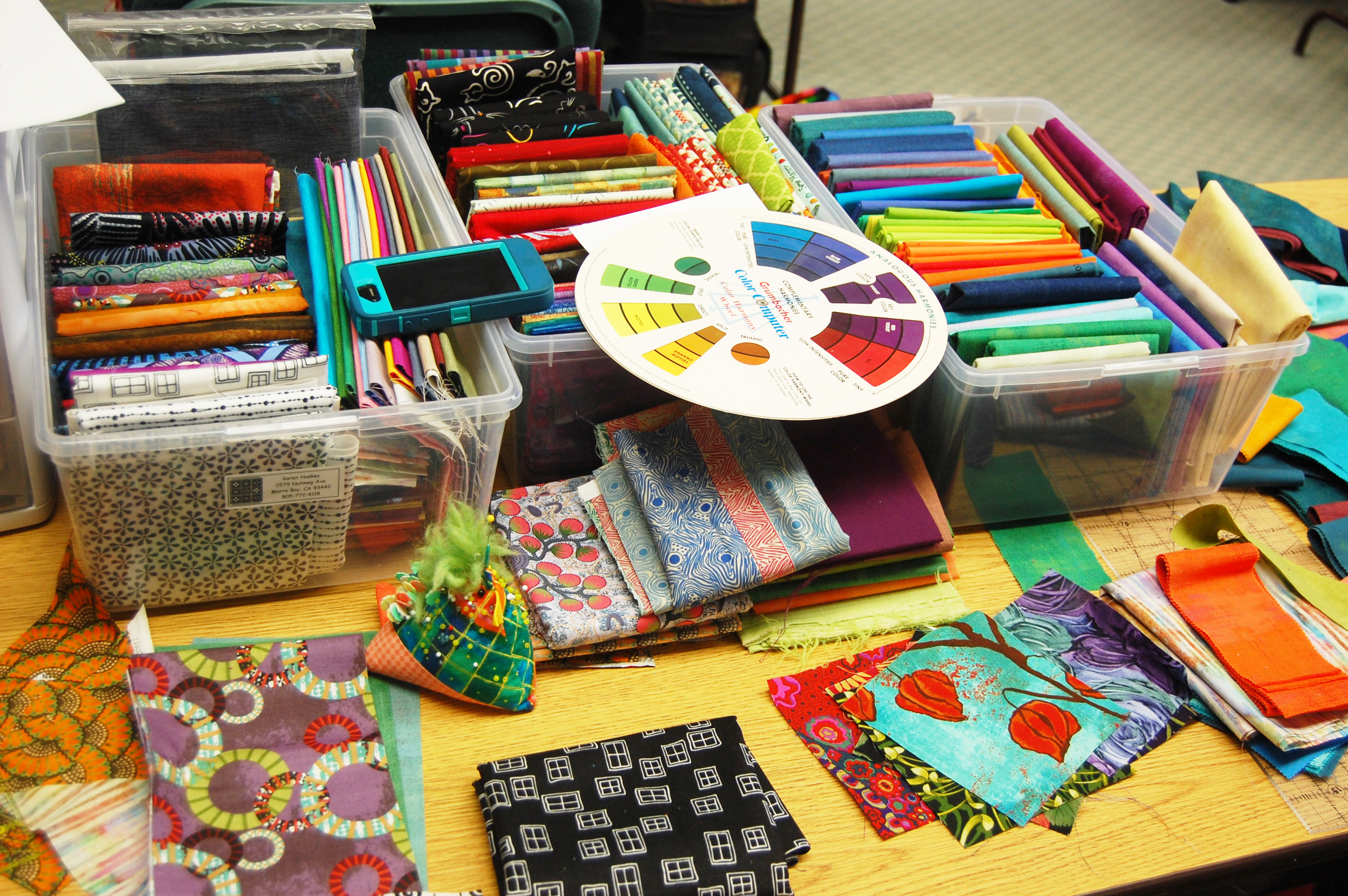
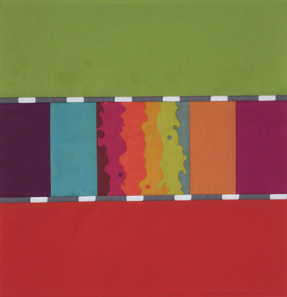
The past month has been a whirlwind of travel, but gosh, it has been FUN. I’m calling it my California Coastal Color Tour because I taught a different workshop for guilds in San Diego, Arroyo Grande, and Santa Cruz. For this post I’d like to show you what twenty diligent (and cheerfully rowdy) Santa Cruz students did with my “Transparent Circles” pattern. The original quilt, made of shot cottons and Marcia Derse prints:
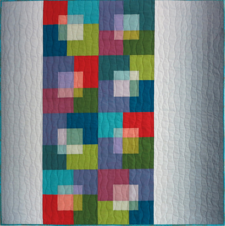
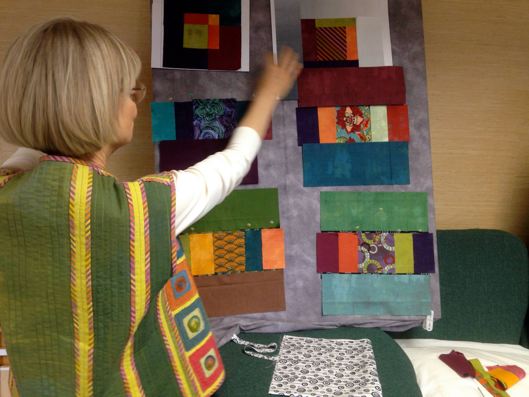
I refer to this kind of transparency as “layered,” which is different from parent/child transparency. Here’s an overview of how I make the blocks, using the upper left block in the quilt as an example.

I piece four smaller squares of light fabrics and four larger squares of corresponding dark fabrics. Using the template below, I cut out a freezer-paper circle (double layer, for stability) and mark each quarter line with a small slit. I then trim the light unit of squares a scant ¼ inch beyond the freezer-paper circle and press the raw edge over and onto the shiny side of the paper. Finally, I appliqué the circle to the larger pieced unit, lining up the seams, and cut away and remove the paper from the back.You make “in and out” blocks, using the same eight fabrics. I love seeing how different the block looks with the light and dark fabrics reversed.

Circles in progress . . . .Brenda’s blocks, with help from Lori. Notice that the colors are in the same location in each block. So cool!What fun to see some of the different blocks. Happy students, successful circles. That’s my traveling buddy Kari toward the back.Meryl (my facilitator for the trip—thank you so much) with her first block. The dark green and orange Grunge fabrics give the block a lovely texture.

Could there be a cuter picture? Pat, my hostess (we loved staying with you!) and her blocks made of Gelato ombrés. She’s the first to try Gelatos for these blocks, and I think they are awesome.

The next day we had breakfast at the home of a local wearable artist. I way taken by the arrangement and color of these elements in her courtyard.Pat and Lori then took us to Back Porch Fabrics in Pacific Grove, a wonderful, must-visit shop on the corner of Grand and Central streets. Who can forget that location?We were in for one more treat the morning we left, Gayle’s bakery, a Santa Cruz landmark and a feast for the eyes and the palette. If you aren’t hungry when you go, you will be when you look at the array of pastries and goodies!Owner Gayle Ortiz did the picassiette (broken pottery mosaic) on some of the tables, as well as one wall.

I don’t know about you, but I see a fabric design in this . . . .We headed home, with new memories, friends, and fabrics. And as often happens after I teach a class, I want to make the quilt again, this time with Grunges and Peppered Cottons. Thanks so much for tuning in this week. For my next post I’ll have tales to tell from another coast—the coast of Florida!


Save

Save

Save

Save

Save

Save

Save

Save

Save

Save

Save

A Kaffe Extravaganza

by Christine Barnes

Earlier this week, Heidi and I presented our program “All Things Kaffe” to the Pine Tree Quilt Guild here in Grass Valley. We talked a bit about his life, showed two short videos, then presented a trunk show of our quilts and wearables that feature his fabrics. We had so much fun, and our audience was wonderfully responsive.

Some of you are in the guild, so we hope you’ll forgive us for reprising a bit of our program in this post and next week’s, when it’s Heidi’s turn. Did you know . . . ?

Kaffe was born in San Francisco in 1937. His great grandfather was a U.S. Senator, and his great-great grandparents founded the Crocker Art Gallery in Sacramento. Kaffe earned a scholarship to the Museum of Fine Arts School in Boston but left at 19 to go to London to paint. On a visit to a wool mill in Scotland with Scottish fashion designer Bill Gibb, he fell in love with the colors and textures of yarn, and on the train going home, a fellow passenger taught him to knit. His first sweater design was published by Vogue, and from there he went on to collaborate with Gibb and Missoni to create colorful, intricately patterned sweaters that make the leap from handcraft to high fashion. 1 Kaffe with bagIn the mid 80s Kaffe began his love affair with needlepoint, called “tapestry” in the UK. He also created stunning mosaics inspired by his extensive travels. In 1988, Kaffe became the first living textile artist to have a one-man show at the Victoria & Albert Museum in London. Now that’s impressive!2 Needlepoint cabbageIn the 90s, he teamed up with Liza Prior Lucy to create and market colorful prints, woven stripes, and shot cottons for quilters. Two other designers, Philip Jacobs and Brandon Mably, produce many of my favorite fabrics under the umbrella of Kaffe Fassett. Check out the Kaffe Fassett Collective on Facebook—there are more than 19,000 members. Heidi and I love to post there and have made friends from all over the world.

I’ll never forget my introduction to his fabrics: In the early 90s, I bought a yard of gorgeous hand-dyed fabric at PIQF. I turned the corner to another booth and spotted a woven stripe by Kaffe. Here’s a scan of the vest I made from those fabrics, in an article I wrote on color for Threads magazine:3 Hong Kong vest in Threads, 7 at 72I recently decided to sort my Kaffe prints into stacks, more or less by color. I have at least a dozen stacks, including one that’s labeled “dull and dreary” (they have their place, too). It’s not very tidy, but it works for me.5 stacks of KaffeI have three (yes, three) IKEA cubes filled wth Kaffe stripes, and as odd as it sounds, I organize them by how recently I’ve acquired them. Here’s one cube, looking down into itCube of stripes 2Almost all of my quilts made from his fabrics have been in past posts, but here’s one I made early on, “In & Out,” using many of his stripes and a variety of light-value batiks. I sent a pic to Liza, she forwarded it to Kaffe, and he emailed me, saying he “liked the way I used his fabric in fresh new ways.” That made my day!4 In & Out early versionBelow are two “Japanese X and Plus” blocks. I challenged myself to make them all in Kaffe, Brandon, and Philip fabrics, except for the background. It was a challenge to gather four medium values for the X and two darker values for the “plus,” but what fun I had!

6 X Plus pink smaller 7 X Plus blue, 8 and 72 smallerThese are just two of the vests I’ve made using his stripes and prints. 8 Summer Triangles smallerIn this vest I used his “Turkish Delight” print for the left front, and a leaf print in the upper area of the right front.

9 Turkish front smallerI love to combine his prints and stripes with Gelato ombrés. This is a block for a quilt I never finished. Someday . . . .16 fresh-cut color 2Finally, I just had to show you the quilt started by student Joanie in my “Swizzle Sticks” class at Sugar Pine Quilt Shop last weekend. It’s all Kaffe—prints, shot cottons, and stripes—and they all came from Sugar Pine. (Aren’t we lucky?) I’ll show you the quilt when it’s finished (there will be sashing). Thanks, Joanie!10 Joanie Swizzle sticksI hope you enjoyed these fun facts about Kaffe Fassett. For more about him and his work, check out his official website. To get an idea of the scope of his fabrics, visit his online store, www.gloriouscolor.com. Tune in next time and let Heidi continue the story with his stunning knits and her own wearables made of his fabrics. Until then, make time to create . . . perhaps with Kaffe?


New York, New York!

by Christine Barnes

Oh my, I had quite the adventure this past week, traveling to Westchester County, NY, to lecture and teach for the Northern Star Quilters’ Guild. The weather was lovely—cool and crisp—and the rain was a real treat for this California girl. Thank you, ladies, for your enthusiasm and your hospitality. You are one lively bunch of quilters!

In between all the fun, we had time to explore the role of value and intensity in creating transparency. For my “Transparent Squares” quilt, it takes two groups of fabrics, eight lights and eight darks. To “fool the eye” into seeing transparent color, you need fabrics that are similarly intense; for example, all muted or all bright, or all somewhere in between. This is one color concept ideally suited to collections because the fabrics in collections tend to have a similar intensity.

For example, Yvonne used all Peppered Cottons for her blocks, below. Aren’t they yummy? (That’s Caryl, student extraordinaire, sitting at her machine in the background. Pay no attention to the figure in the corner—tis the season.)

NY peppered cottsOn the way back to the hotel, I snapped this pic of miniature mums. Aren’t these colors great with the “peppered” fabrics?

NY mumsCarol used her collection of Cherrywood hand-dyes, below, to make her suede-like blocks. Slight variations in value (the orange fabric, for example, is more medium than dark) make the blocks more interesting. Once the units are joined, the transparency “snaps” into place.NY, Carol, CherrywoodChris, below, came with all Shot Cottons by Kaffe Fassett. The see-through center units seem to magically float above the darker background pieces. The block construction for this quilt couldn’t be simpler: you sew eight different “basic blocks,” each consisting of one lighter-value center square surrounded by four strips of a darker-value fabric. Then you “whack” the blocks off-center and recombine the units to make seemingly complex blocks. She’ll add borders of my favorite gray ombré to complete her quilt.

NY Chris's bocks joinedHere are Meg and Jane working on their blocks. Love, love the visually delicious solids. You can use prints in creating transparency, as long as they are tone-or-tone or other low-contrast patterns.

NY Meg and JaneAnd, of course, what’s a workshop without a lot of laughter? That’s Clarie at the ironing board, with JoAnne (my hostess), Judy, and Nancy having fun.

NY Caire, Joanne, Judy, Nancy Judy was so kind to take me back to the hotel after the class. We took the scenic route so I could see more of the area, and I loved the fall colors, beautiful homes, and stone walls. Well, we got to talking and laughing so much that we strayed a bit. Judy stopped at a cute inn, below, for some quick directions. I was delighted to have the “extended tour.” Thank you, Judy. And many thanks to those students not pictured; you made my trip memorable.

NY inn Finally, had the weather been a bit more cooperative, I would have taken more pics of this charming part of New York state. But in their place, here’s the brick school where my local guild, Pine Tree Quilt Guild, meets every month. Not New York, but very fall-like.

NY HennesseyI’ll be in San Diego in a few weeks, teaching a new class titled “Modern Color” for the Village Quilters guild. Wherever you are, I hope your season is colorful!

Christine

Zephyr on My Mind (Still) + a Look to Next Year

by Christine Barnes

I love October! My favorite poem when I was twelve was “October’s Bright Blue Weather,” by Helen Hunt Jackson. The last stanza reads:

O sun and skies and flowers of June,
Count all your boasts together,
Love loveth best of all the year
October’s bright blue weather.

At Zephyr we had both bright blue weather and bright blue water. The changing colors of the lake (sometimes you see bands of different blues, almost like an ombré) made it magical.

The retreat was magical, too. By now you’ve read the post-retreat thoughts of Heidi and Sandra. I heartily second their enthusiastic accounts of our time there. Lest my students feel left out, here are some images from my Luminosity and Luster workshop:

First, she who brings the most fabric . . . has the most to work with.

F Karen's tableBelow are some of the blocks Karen made with her yummy selection of fabrics. Note the “swizzle stick” borders, narrow strips of fabric inserted between the block segments.D1 Karens blocks copyLuster exercises, starting with strips of gray ombré that I provided. How different the blocks look, depending on the choice of fabrics for the center units. Compare the lower left and lower right blocks, for example.A luster ex, largerEileen worked with a pattern she brought, with the idea of creating luminosity. C Eileen's blocksAs she played with her options, it became apparent that she was also creating transparency, almost by accident. A few days after the retreat ended, Eileen sent me a pic of her quilt top:K Eileen's finished top, transAren’t the bands of lighter-value yellow running horizontally through the quilt cool? She gets extra credit, for sure!

Nancy was also working with luminosity, and I’ll show you her finished quilt in a future post (no pressure, Nancy). Here she’s just relaxing. See how neatly her fabrics are piled at the front of her table? More extra credit. The fabrics choices pinned to the wall are Noelle’s, for her Sassy Circles quilt, but she somehow escaped the camera.I Nancy at her tableHere, Teresa begins to work with Serenity ombrés, Kaffe Fassett stripes, and Marcia Derse prints.G Teresa works with ombresAnd her blocks take shape. Note the center squares, cut on the bias. They’re a bit harder to work with, but they certainly add movement to the blocks.E Teresa's blocksMany thanks to Noelle, Nancy, Nora, Teresa, Karen, Jackie, Eileen, and Cindy. I can’t imagine my time there without you. (I wish I had taken more pics!) I really enjoyed meeting the students in the other classes and seeing their amazing work.

I’m adding this pic of the back of my vest because so many asked me about it. I pieced the vest back, with a green hand-dye on the outside and yellow-green osnaburg on the inside. What you see are the seam allowances, which I purposely put on the outside. The raw edges are bound with 1-inch strips of a Kaffe stripe cut on the bias. This technique is called the Hong Kong seam finish, and if you Google it, you’ll find plenty of videos and still tutorials.J back of my vestWe’re working on plans for next year, and we’re very hopeful that we’ll be able to add that extra sewing day. I’m thinking about transparency, one of my favorite light effects. There are two kinds: parent/child and layered. Here’s an example of layered transparency, the illusion that lighter see-through shapes float above darker shapes. There will be a variety of exercises and three or four quilt design options.L Trans squares, bound-1Finally, I left Zephyr and headed home up the west side of the lake. A stop at the Emerald Bay lookout is almost mandatory. Talk about “bright blue water,” with bits of greener blue.H Emerald BayUntil next time, enjoy these glorious October days and keep scheming and sewing. Is there anything better?!


Solids + Prints: A Colorful Combination

by Christine Barnes

I’ve had a love/hate relationship with plain solids for years. They seemed dull, and patterned fabrics seemed to die in their company. The two exceptions were hand-dyes from Cherrywood (they look sueded) and shot cottons from Kaffe Fassett (with different-colored warp and weft threads, they look almost iridescent). With the exception of those fabrics, I shied away from solids.

But with the advent of “visually delicious” plain solids from a number of companies—Moda, Robert Kaufman, Clothworks, to name a few—my rocky relationship has turned into infatuation. I never thought I would feel this way, but I’m crazy about solids!

I wanted to develop a third version of my “Brushed Metal” quilt (you saw the first two colorways in earlier posts). I began by taking stock of what I had in the way of solids. Not enough, of course, so I headed to a local shop for more. To make the design process easier, I cut strips from all the possibilities and pinned them to my design wall. I love this approach because once you cut everything, knowing that you may need to cut more, assembling the blocks goes quickly. I like this image—it looks like “color DNA” to me.2a just stripsMy plan was to create blocks that featured a center print surrounded by narrower and wider rectangles of color. This funky-flower print is by Kim Schaefer.E funky flower cen lighter stripsI didn’t try to match the colors in the prints and solids—you’ll make yourself crazy doing that. But I chose solids that had something in common with the center fabric. The far right strip is red-violet, for example, while the violet in the print is a truer violet. These differences make the block richer and more original.

Here’s the same combination of solids, with a gray-and-white center. Love those neutral dots!F gray dot enter 2From there I moved on to a block with “swizzle stick” borders, my term for skinny strips. I have a simple method for inserting these strips without the “unpleasantness” of bulky seam allowances. (Notice that the skinny strips are from the same Kim Schaefer print as the first block.)

D original If you’ve seen my quilts, you know that I have an ongoing love affair with stripes. This Kaffe Fassett stripe fit perfectly into the block design. It also gives this very symmetrical block a bit of asymmetry.A AmishMoving right along—can you tell how much fun these blocks were to make?—I combined a wavy stripe with solids. Again, I didn’t attempt to match colors in the print and the solids, but the colors are related. B 1 citron plain centerThen I had to try the block with the wavy pattern running vertically and with skinny strips from the gray-and-white dot. When I cut the strips, I centered the white dots to create the illusion of a striped fabric. I like the crispness the skinny strips add to the block.B .citron with gray dot sqizzleJPGI have no idea which blocks I’ll use in the quilt—there are more combinations waiting to be discovered. But I do plan to use nine blocks and set them with sashing strips and cornerstones. To give you an idea of the design, here are four of my favorites, with that gray dot as cornerstones:

Blog mock up, 5-30-14I’m still searching for a light-value sashing fabric, not too light, not too busy. I’ll show you the finished quilt when I find the perfect fabric. Until then, consider plain solids and patterned fabrics—it’s a winning (and colorful) combination!

p.s. This basic block works beautifully for luminosity and luster, the focus of my retreat workshop.


Asymmetrical Color

by Christine Barnes

For this post, allow me to digress from my retreat workshop topic, “Luster and Luminosity,” and focus on “asymmetrical color,” a concept I came up with to describe the way I often work with color. It’s a simple idea: color used in unequal quantities, in an asymmetrical block or quilt design. Let me show you what I mean:

I like funky-flower patterns, so you can understand why I fell in love with this Alexander Henry fabric.funky fowers, lighter

I created this 12-inch block, which is just an isolated section of one of my symmetrical quilts, tweaked and enlarged a bit. With this design I saw an opportunity to use color in different quantities, in a way that looks and feels balanced.Asymmetrica blockPutting the large-scale floral in the large square was a no-brainer, but what to use for the smaller shapes? I chose Kaffe Fassett shot cottons because, like the patterned fabric, they are low-intensity, or muted. The shot-cotton colors are related to the floral colors, but they don’t quite match, which makes the design more sophisticated and keeps it from looking formulaic.just fabrics, modern fleurs, lighter

Here’s the mock-block. The variations in the values of the shot cottons, from the light celadon in the lower rectangle to the dark merlot in the corner square, create a design within the design and enhance the off-center look of the block.mock block, lighter

Next I asked myself, what happens when this block is repeated in a quilt? Here’s how it looks in a straight set, though in reality the floral pattern would vary from block to block:modern fleurs 2, lighter

I found this to be a bit much; there’s no place for your eye to rest. (I’m a huge fan of “visual relief,” providing quiet areas within larger areas.) And when I rotated some of the blocks to vary the layout, the floral squares touched and looked even more fragmented.

So I spaced out the blocks, which begs the question: what to do with the plain squares? If you know me, you know my first thought is usually “stripe.” Now I’m looking for just the right one. Even without a fabric in the alternate squares, I like the light-and-airy look of this layout.

modern fleurs 4 lighter

Finally, my mind turned to thoughts of a wearable, perhaps a vest, with a pieced right front and this Kaffe Fassett stripe for the left front. What fun to see where a fabric takes you!ALL fabrics, lighter

Changing gears, here’s another example, my quilt “Squares and Stripes.” I designed asymmetrical blocks and rotated them for the overall design. I also varied the width of the borders. But notice how I lined up the stripes in the borders to suggest planes of color flowing beneath the blocks. Sometimes you need a bit of symmetry to calm an asymmetrical design.AA Squares and StripesNext time, I promise to show you new ideas for luminosity. Until then, keep experimenting with color. The options really are endless. So long for now!