Through the Magic of Stripes

by Christine Barnes

The poet Robert Burns wrote in his poem To a Mouse, “The best laid plans of mice and men often go awry.” It’s true for quilters, too, and I am living proof. This is the story of my crooked path to a new plan for a quilt.

By now you know that I adore plaids. I also love triangles, and the best way to create triangle squares is with Thangles, strips of paper that have solid and dashed lines for sewing and trimming. They are magical and so easy to use.

I paired a number of my plaids with Grunge semi-solids and set out to make 8′ finished blocks. I liked the first block a lot—the contrast between the plaid and semi-solid fabric makes the design read. These are just the four “raw” units, not yet joined.0-plaid-block-no

Then, I confess, I neglected to follow my own advice and started pairing fabrics and sewing triangle units like crazy, without auditioning. Big mistake. Most of the resulting units were too blended, too contrasty, or just plain chaotic. Trust me, you don’t want to see them! On the phone with my friend Kari, she said, “You mean you didn’t practice what you preach?” Ouch. Count on a friend to speak the truth.

Chastened a bit, I changed gears and decided to work with my other favorite fabrics, stripes, of which I have many. Below is a shot cotton solid and a yummy woven stripe. I rough-cut the fabric strips 5″ wide and 11½” long. Notice that the stripe is running lengthwise—this is very important.
1-strips

Enter Thangles for 4″ finished units (the package is on the right, below). I love them for the precision and ease—no more cutting triangles and trying to pin and sew them on the bias. Here’s how to use them:

1. Layer the fabrics with a Thangles strip and pin through all layers. You would normally layer the fabrics right sides together, but because both of my fabrics are woven, it doesn’t matter. You only need a few pins, one at each end, and two perpendicular to each solid diagonal line. Just enough to keep things from moving.2-thangles

2. Shorten your stitch and sew precisely on the dashed lines. How short is short enough? I put mine down four steps from the default, but you’ll need to experiment to find what’s right for you. Once you sew the first set of strips and start to remove the paper, you’ll know if the stitch needs to be shorter. 3-sew-on-dotted-line

3. Trim the excess fabric along the side edges, the top and bottom, and the center line. 4-thangles-shapes-sewn-trimmed

4. Fold the paper triangles back along the stitching lines, crease them with your thumbnail, and tear the pieces away. Here I’ve folded back just two of the paper triangles. 5-remove-some-paper

5. Tear off all the paper pieces, including the short strips between the stitching lines.

7-side-by-side-units-with-paper-scraps

6. Cut the triangles apart between the stitching lines.

7. Press the seam allowances open. I press using a seam roll because it keeps the seam from stretching on the bias and generally makes the process go better and faster. Mine is made by Dritz and was inexpensive. (It’s plaid on the other side.)8-pressing-on-seam-roll

8. Voila! You have four 4½” triangles units, which will finish to 4″. I don’t trim the dog ears at this point; I find them helpful when joining the units.9-four-unts-pressed-open

9. Now the magic happens. Because you cut the original striped fabric lengthwise and used Thangles, the stripes are automatically perpendicular to each other. I love seeing how the block looks at this stage. The four units in the image below are not yet sewn together. See how the diagonally opposite triangles relate? They are actually identical.10-raw-units-arranged

10. Now back up and sew the top and bottom units together to make two rows. Tip: It’s not necessary to pin through the diagonal seams perfectly. If you sew and trim carefully, things will naturally line up at the outer edges and you’ll have good “points.”

Also, when I join the rows, I pin the outer edges carefully and let what happens at the center intersection just happen. I do not like to “ease” one section in and “stretch” another section out. Life is too short. With stripes, your eye won’t notice any slight misalignment.11-join-the-rows

11. Join the rows to make a block with “spinning” triangles. I call these a cheap thrill because Thangles do the work for you. And you end up looking sooooo smart.12-finished-block

I now have nine different blocks, and I’ll show you the setting in a future post or newsletter. If you don’t already get “Christine’s Color Connection,” you can sign up on my website Home page or on your smartphone by texting COLOR4Q to 22828.

There’s a bit of snow on the ground this morning. Stay cozy and warm in this “bleak midwinter.” It’s a great season for sewing!

Sweet Stuff

by Christine Barnes

Forgive this brief post (or maybe you’re thankful it’s short). For the next few weeks, it’s all about the retreat, making samples, printing exercises, “hunting and gathering” fabrics for my students to use. I can’t wait! What else is on my mind . . . ?

As I’ve been gathering and sorting fabrics, I’ve come to realize that my taste in fabric changes in the summer. It’s as if I crave lighter, brighter, “sweeter” colors and patterns. Here are two Rolling Stone blocks, one of the exercises for my retreat workshop. I’m calling the version below “Birthday Cake” because it reminds me of a celebration, and I’m giving myself extra credit for using not one, but two, stripes. (My students get “extra credit” for using stripes. They’re a great counterpoint to more organic patterns, like the one in the center of this block. Dots do much the same thing.) Party Time!, 10@72 copy

I’ve named the block below “Samba!” in honor of the Rio Olympics. You can see that I’m a serious stripe-aholic—with no hope or desire for rehabilitation. I love the white-with-black background fabric, which one of my students introduced me to at last year’s retreat. (Thanks for sending me two yards, Linda!)Samba! 10@72 copy

For those who also receive my color newsletter, forgive this repeat. “Spumoni,” below, is my take on the Japanese X and Plus block. This is one of the project possibilities in my workshop, so hopefully you’ll see pics of students’ quilts in later posts. When I joined the blocks, I knew it needed “something else,” but I didn’t want to add traditional borders. I lucked out and had the perfect large-scale, black-and-white dot (different from the dot in the birthday-cake block). The X and Plus block is so much fun to plan and a breeze to sew.Spumoni

There’s a subtle color lesson in these blocks, too. Value, the lightness or darkness of color, separates pieces in a block or quilt and establishes the design of the block. But when the values are similar—which often happens because 80% of the fabric we buy is medium in value—variations in color and pattern will differentiate the pieces. Some of my blocks read better than others, and I like the “color chaos” in those that don’t.

Changing gears, if you follow Heidi on Instagram, you know that our county fair was last week. You should plan to come sometime because the Nevada County fairgrounds were named one of the 10 prettiest in the state. I usually forget to enter, but this year I remembered, and my Turkish Delight Vest and Swizzle Sticks quilt got red ribbons. Who won the blue ribbon and Best of Division in Wearable Art? Our own Mary Boalt, for her amazing linen coat. Congrats, Mary!red ribbons, couty fair

I’m going to deliver on my promise of a short-and-sweet post and sign off. To all of our retreat students, safe travels, and see you at the lake soon!

Save

Save

Save

Save

Save

Save

Everything’s Coming Up . . . Circles?

by Christine Barnes

Happy summer! It’s not yet summer by the calendar, but the longer days and warmer temps make me feel ambitious, which leads, hopefully, to new ideas and projects. Yes!

Before I get down to business though, I wanted to mention that a spot has opened up in my Transparency workshop at Zephyr. Interested? Check out the retreat details here and scroll down to see the samples and supply list.

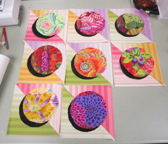
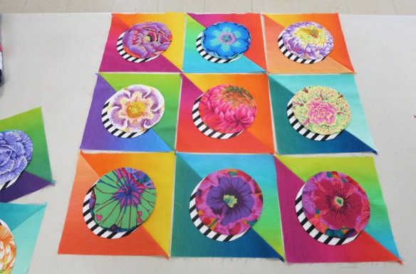
Shadowed-circle quilts are fun, too. They’re a “home run” in my book because they have the cohesion of a repeat-block design, with the variation of different colors and prints. The constant—the shadow—unifies it all. For “Sassy Circles II,” below, I “went radical” and made black-and-white striped shadows. (Check out my Gallery for three other circles quilts.)

Sassy Circles II @ 10 in.

Since then I’ve played with lots of different shadows. The first two blocks below have shadows cut from opposite colorways of the same fabric design. To my eye, the mostly white shadow looks larger than the mostly black one, but they are the same size. I love the square dots in the third block. White fabrics don’t look like shadows exactly, but they’re fresh, and they add an element of surprise.Three shadowed circles AA FINAL

What follows are pics I took in workshops in Elk Grove and San Luis Obispo, CA. Given the time that has passed, I’ve forgotten names, but I thank all my students for sharing their work.

The circles below were cut from different areas of the same print, and the background triangles were cut from Serenity ombrés. 1 serenity + harvest printKaffe Fassett prints and colorful ombrés are a winner.3 nice! coll of KafffeOther kinds of fabrics make great background squares. These soft stripes really lighten the mood and say “candy” to me.4 stripe bkgrd, KaffeThe shadows in these blocks were cut from one multi-colored Japanese stripe. And what fun, a baby quilt of circles! 5 SLO zoo animalsWhat’s interesting about the blocks below, besides their yummy pattern and color, is that the upper right and lower left background squares were created from two squares of the same ombré, right sides together. The shifts in value and color in the ombré yield two very different squares.

7b Irene?Instead of cutting the triangles for each background square from one fabric, Patti mixed up the ombrés. I like the quirkiness, the unexpected combinations.9b Patti blocks agaiI tell my students they get “extra credit” for using stripes, like the black-and-white pin stripe below. The pieced circle at the top is a “bonus circle” that’s created when you trim the layers from the wrong side. I see potential for transparency here . . . .12 striped shadowsWhite shadows may not give you the dimension of black shadows, but they do provide visual relief. I love, love these floral prints.13 2 blocks with dotted shadowThe island print below is a stylized take on more naturalistic floral prints. From a distance, this block is dynamite. 14 YUMMY on Y-B-G ombre

And finally, wow, look at these bold shadows. Linda also cut triangles from various ombrés for some unique color combinations. And she did a fabulous job of centering the motifs in the circles. Well done!15 YUMMY B&W striped shadows

That’s it for now. I hope you’re seeing new possibilities with circles and shadows. A huge THANK YOU to all of my students for the enthusiasm and willingness to learn that you bring to each class. You make this job so much fun!


Asymmetrical Color

by Christine Barnes

For this post, allow me to digress from my retreat workshop topic, “Luster and Luminosity,” and focus on “asymmetrical color,” a concept I came up with to describe the way I often work with color. It’s a simple idea: color used in unequal quantities, in an asymmetrical block or quilt design. Let me show you what I mean:

I like funky-flower patterns, so you can understand why I fell in love with this Alexander Henry fabric.funky fowers, lighter

I created this 12-inch block, which is just an isolated section of one of my symmetrical quilts, tweaked and enlarged a bit. With this design I saw an opportunity to use color in different quantities, in a way that looks and feels balanced.Asymmetrica blockPutting the large-scale floral in the large square was a no-brainer, but what to use for the smaller shapes? I chose Kaffe Fassett shot cottons because, like the patterned fabric, they are low-intensity, or muted. The shot-cotton colors are related to the floral colors, but they don’t quite match, which makes the design more sophisticated and keeps it from looking formulaic.just fabrics, modern fleurs, lighter

Here’s the mock-block. The variations in the values of the shot cottons, from the light celadon in the lower rectangle to the dark merlot in the corner square, create a design within the design and enhance the off-center look of the block.mock block, lighter

Next I asked myself, what happens when this block is repeated in a quilt? Here’s how it looks in a straight set, though in reality the floral pattern would vary from block to block:modern fleurs 2, lighter

I found this to be a bit much; there’s no place for your eye to rest. (I’m a huge fan of “visual relief,” providing quiet areas within larger areas.) And when I rotated some of the blocks to vary the layout, the floral squares touched and looked even more fragmented.

So I spaced out the blocks, which begs the question: what to do with the plain squares? If you know me, you know my first thought is usually “stripe.” Now I’m looking for just the right one. Even without a fabric in the alternate squares, I like the light-and-airy look of this layout.

modern fleurs 4 lighter

Finally, my mind turned to thoughts of a wearable, perhaps a vest, with a pieced right front and this Kaffe Fassett stripe for the left front. What fun to see where a fabric takes you!ALL fabrics, lighter

Changing gears, here’s another example, my quilt “Squares and Stripes.” I designed asymmetrical blocks and rotated them for the overall design. I also varied the width of the borders. But notice how I lined up the stripes in the borders to suggest planes of color flowing beneath the blocks. Sometimes you need a bit of symmetry to calm an asymmetrical design.AA Squares and StripesNext time, I promise to show you new ideas for luminosity. Until then, keep experimenting with color. The options really are endless. So long for now!