What a Week!

by Christine Barnes

Retreat 2017 is now history, and what a great week it was. Let me begin with my intrepid, up-for-anything students—you were wonderful, one of the best classes I’ve ever had, and your blocks and projects prove it. You were fun and brave and always cheerful. Allow me to show off your work!

We began with four mock-block exercises that illustrate the adage that “Value does all of the work, and color gets all of the credit.” Contrasts in value create two important effects in quilt design: 1) they add a sense of depth (dark shapes seem closer, lighter shapes farther away) and 2) they establish the design (a dark star shows up on a light background).

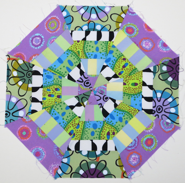
When the values (lights, mediums, and darks) are somewhat similar, differences in pattern and color can differentiate the shapes, as in these Boy’s Nonsense mock-blocks. Paula combined two very different patterns to establish the design.Barb’s modern background fabric makes her block light and lively.Marti’s intense center square contrasts with the somewhat duller ombré rectangles.
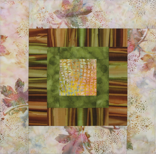
The Granny Square block is a great format for playing with light, medium, and dark values. In Lisa’s block, there’s even “accidental transparency.”
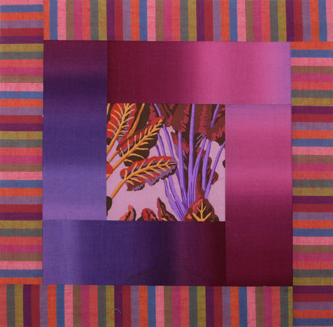
The way in which Patti used the linear prints is smashing. (I want this block. 🙂Gale had an assist from her sister Mukhya in pasting up her Best Friends block. A bright print for the outer triangles makes the design even bolder. See how well the dark skinny triangles stand out against the red-orange half-square triangles.A busy Alice in Wonderland print separates nicely from the background and the dark skinny triangles in Susan’s block.An op-art, black-and-white print gives Gail’s block movement.I’m loving the vintage/modern vibe here, with contemporary fabrics and a Featherweight machine. Yes!Color therapy!Gail auditions fabrics for Laurie’s Spumoni blocks.That’s Susan behind her Urban Sunsets quilt top. It’s difficult to see in this shot, but the black-and-white swizzle sticks have an undulating design (check out the upper right block).Jane’s Urban Sunsets units are wonderfully different in value, color, and pattern.Variations in value, color, and pattern make for an elegant, minimal design. Lisa’s block, I believe.Cindy working on her Urban Sunsets blocks.Another one of Cindy’s blocks in progress. She’s bordering her center units with a green Gelato ombré instead of the gray. (I can’t wait to show you the finished quilt!)Gail went to town with Kaffe fabrics for Spumoni. See how the different values affect the look of each block.Isn’t our class wall colorful??? There was even more to see, on moveable design boards.These Farmer’s Wife blocks, done the morning of the last full day, really show the growth in everyone’s work. Well done, ladies!

Green Grunge triangles flank the nine-patch unit in Ellen’s block. Dark-value corner squares advance and give the design a strong sense of dimension.Though there is some blending in the nine-patch unit, I’m loving the colors and prints in Gale’s version.

Lisa’s clicked when she positioned the leafy squares in the nine-patch unit so the values contrast with the greeny-brown triangles.The color in Laurie’s block is a bit off in this photo, but wow, it sure works! The nine-patch unit advances because the values are darker than the gold triangles.OK, not our best look, but hey, it’s the last morning and we were weary. We had 12 students in all (Gale, Patti, Susan, Ellen, and Jane are missing from this pic). This photo, taken by our phenomenal assistant Kathy, says it all. There is no other place on the planet like Lake Tahoe.But wait, there’s more! Gail and Laurie, my students from the Dakotas, rode around the lake, all 72 miles of it, in the “Tour de Tahoe” on Sunday. Congrats, ladies, on ending your week with a bang. I told my young hair stylist about your ambitious ride, and she paused and said, “Well, that sure changes my idea of what quilters are like.” Too funny!With that I’ll sign off. Thank you for looking at my students’ amazing work. And thanks to my students for making my week so memorable. As I’ve said many, many times, “You make this job so rewarding and so much fun!”

Save

Save

Save

Save

Save

Save

Save

Save

Save

Save

Save

Save

Save

Save

Save

Save

Save

Save

Save

Save

Save

Save

Save

Save

Save

Save

Save

Save

Save

Save

Save

Save

Save

A Detour, Short and Sweet

by Christine Barnes

I’m home from my teaching travels, and after so many weeks on the road, my own bed never felt so good. (Naples was wonderful—thank you Judy and Linda! I’ll write about it in my next post.) I’ve been working away on the project quilts for the retreat. One of them is based a block that is so versatile that I just had to try it with transparency.

The block is known as “Antique Modern,” which seems a bit of an oxymoron. And here’s my quilt top, which I’ve named “Aerial,” after the name of the sashing fabric. If you don’t follow my newsletter, you can click here to see the April issue and read the story behind choosing the fabrics.Every time I looked at the block, I thought, “I wonder if . . . .” So yesterday I took a quick detour from my “Crazy Anne” quilt for the retreat to play with the design.

I fell in love with this mini harlequin print when I was at Rosie’s in San Diego in April. The three pink solids you see are from the width of one ombré, which I folded to show the color and value range. I know, I’m a broken record, but ombrés have SO much potential.The result isn’t quite as transparent as I had hoped. Some ombrés aren’t that successful because they tend to be too opaque. Never mind—the center fabric carries the day for me, and the black-and-white “stripe” makes it even more modern.Then I asked myself, “What would happen if I eliminate the center square?” Instead of rectangles surrounding a center square, you see a large, open area with a whole new set of possibilities.For this version I needed three fabrics—a light parent, a dark parent, and a child. The lightest fabric is actually the lighter area of a yellow-green/olive ombré. The dark green is the wrong side of a Grunge. (Hey, all’s fair in love and quilting.) The “child,” a Loni Rossi print, looks like a combination of the two parents, as if the light and dark colors were combined but not completely blended.I layered and glued the cut pieces to “fool the eye.” The real thing, when sewn, is much more convincing because it’s flatter. (This pic was taken in the evening, so the color is off.)

The finished mock-block.

That was fun, like reading a few chapters in a novel when you should be studying for finals. Next week it’s back to my retreat projects and full speed ahead on Zephyr. As always, thanks for looking and reading. I hope your summer is off to a great start—and that it includes a little color play with fabric you love!

Save

Save

Save

Save

Save

Save

Save

Save

Save

Save

Save

Cheers! (And Nice News)

by Christine Barnes

First, we have good news to report on Sandra: no need for surgery. The ortho doc says it will take time, but she is in good spirits and already has a bit of mobility in her left arm. Each of us has seen her, and all things considered, she looks great. So, raise a glass (or in the case below, a vase of my favorite ornaments) to Sandra—keep mending!ornaments 3 copyMe, I’m happily re-organizing my life, starting with my sewing room. It feels SO good to make progress, and in the process I’ve unearthed buried treasure in the form of blocks I had fun making, but haven’t used yet. In no particular order:

For several years I made 20-inch pillows as gifts. This pillow top was supposed to be finished with 4″-wide green velvet borders. The angel fabric in the center came from Heidi’s fabulous fabric store, back in the day.Xmas pillowUsing the same format, I made a woodsy block that I planned to frame. It’s a great format for working with value to create a sense of foreground/background.Woodsy blockLove the rich “lodge” colors of the ombré in this 12-inch block. Add a Kaffe print and a yummy batik . . . Lodge hot patThen there was the Kaleidoscope class taught by Jan Soules at Pine Tree Quilt Guild. I still need that 12-step program for pattern addicts because as you can see, I can’t help myself. This was the first of two blocks I made. I plan to make more, honest.Spider Web, Jan S.As you well know, I love, love the combination of Kaffe stripes and prints with ombrés. This block didn’t make it into my Lustrous Squares II quilt, but I think it has a future as a pillow top. It’s 16″ square.ChardFinally, I’m happy to tell you that my “Swizzle Sticks” quilt, which you saw in various stages, is in the latest issue of American Patchwork & Quilting. Here’s how they styled the shot that went with the article. (Used with permission from American Patchwork & Quilting® magazine. ©2015 Meredith Corporation. All rights reserved.)styled APQ coverBy coincidence, the quilt on the cover, by Marcia Harmening, features two of the Gelato ombrés I’ve used in so many of my projects. Small world.APQ0216_DIG1HR_600That’s it from me for now. I hope your days are merry and bright, and that they include time to plan (if not start) a quilt or wearable or other project you’re wildly passionate about. Cheers!


Everything’s Coming Up . . . Circles?

by Christine Barnes

Happy summer! It’s not yet summer by the calendar, but the longer days and warmer temps make me feel ambitious, which leads, hopefully, to new ideas and projects. Yes!

Before I get down to business though, I wanted to mention that a spot has opened up in my Transparency workshop at Zephyr. Interested? Check out the retreat details here and scroll down to see the samples and supply list.

Shadowed-circle quilts are fun, too. They’re a “home run” in my book because they have the cohesion of a repeat-block design, with the variation of different colors and prints. The constant—the shadow—unifies it all. For “Sassy Circles II,” below, I “went radical” and made black-and-white striped shadows. (Check out my Gallery for three other circles quilts.)

Sassy Circles II @ 10 in.

Since then I’ve played with lots of different shadows. The first two blocks below have shadows cut from opposite colorways of the same fabric design. To my eye, the mostly white shadow looks larger than the mostly black one, but they are the same size. I love the square dots in the third block. White fabrics don’t look like shadows exactly, but they’re fresh, and they add an element of surprise.Three shadowed circles AA FINAL

What follows are pics I took in workshops in Elk Grove and San Luis Obispo, CA. Given the time that has passed, I’ve forgotten names, but I thank all my students for sharing their work.

The circles below were cut from different areas of the same print, and the background triangles were cut from Serenity ombrés. 1 serenity + harvest printKaffe Fassett prints and colorful ombrés are a winner.3 nice! coll of KafffeOther kinds of fabrics make great background squares. These soft stripes really lighten the mood and say “candy” to me.4 stripe bkgrd, KaffeThe shadows in these blocks were cut from one multi-colored Japanese stripe. And what fun, a baby quilt of circles! 5 SLO zoo animalsWhat’s interesting about the blocks below, besides their yummy pattern and color, is that the upper right and lower left background squares were created from two squares of the same ombré, right sides together. The shifts in value and color in the ombré yield two very different squares.

7b Irene?Instead of cutting the triangles for each background square from one fabric, Patti mixed up the ombrés. I like the quirkiness, the unexpected combinations.9b Patti blocks agaiI tell my students they get “extra credit” for using stripes, like the black-and-white pin stripe below. The pieced circle at the top is a “bonus circle” that’s created when you trim the layers from the wrong side. I see potential for transparency here . . . .12 striped shadowsWhite shadows may not give you the dimension of black shadows, but they do provide visual relief. I love, love these floral prints.13 2 blocks with dotted shadowThe island print below is a stylized take on more naturalistic floral prints. From a distance, this block is dynamite. 14 YUMMY on Y-B-G ombre

And finally, wow, look at these bold shadows. Linda also cut triangles from various ombrés for some unique color combinations. And she did a fabulous job of centering the motifs in the circles. Well done!15 YUMMY B&W striped shadows

That’s it for now. I hope you’re seeing new possibilities with circles and shadows. A huge THANK YOU to all of my students for the enthusiasm and willingness to learn that you bring to each class. You make this job so much fun!


“Swizzle Sticks” and “Cut Flowers”

by Christine Barnes

Oh my, if you could see my sewing room! On second thought, that’s not a good idea. With our big retreat just ten days away, I’m making samples, packaging fabrics, printing patterns, and chasing down my clipboard with the long to-do list. (Stacks of ombré strips are below, ready to be bagged.) Whew! But as much work as it is to host a retreat, the three of us agree it’s been a lot of fun.packs of 5" strips, smallToday I’m going to bring you up-to-date on two quilts you’ve seen in progress in previous posts. In June I was auditioning sashing for blocks that mix solids and prints. Here’s a brief recap:

First up, the dots. Love, love dots, but the seams were clearly going to cause problems with the dot pattern.

0 b&w dotsI adored this funky-flower, black-and-white print from Moda; it made the blocks float. I was set to sew, yet nagging at me was a fabric with rows of black-and-white dots. Back to my design wall and my stash. 3 funky flowersHere’s the finished quilt. Four-patch cornerstones make it easier to stitch accurate sashing, and, by aligning the dots vertically and horizontally, each four-patch is framed by a row of dots. I like that the four-patches link the blocks. They also imply single diagonal chains that appear to be behind the blocks. I call this quilt “Swizzle Sticks,” for the skinny borders in each block. I’ll be teaching this workshop at The Cotton Patch in the new year.7 Swizzle Sticks SHWSChanging gears, in June I showed you several blocks like the ones above, minus the skinny borders. Ombrés (these are from the Gelato line, sold on my site) work so well with multicolored Kaffe Fassett Collective prints and stripes. Nothing quite matches, but everything works.Bright Kaffe block 2 Bright Kaffe block 1 Here’s a mock-up, created using InDesign. I’m calling it “Cut Flowers” because the colors remind me of a bouquet, and the prints are literally slices of Kaffe Fassett fabrics. I love the white-and-black wavy stripe, but it’s just busy enough to keep the blocks from floating. I’m still thinking. . . .Barnes, "Bright" quiltI have now made (or am working on) three quilts—”Brushed Metal,” “Swizzle Sticks,” and “Cut Flowers”—using the same basic block. I like the structure of the block because it has vertical and horizontal elements, with small and large rectangles and center squares. I think I’m done with it and ready to move on. And isn’t that the joy of quilting? There’s always another quilt and another batch of fabulous fabric waiting to challenge and delight us.

See you again after the retreat. We’ll give you a full report on all the creative fun. And if you aren’t coming this year, we’re already planning for 2015!

A Mind on Fire + Lustrous News

by Christine Barnes

Greetings, all! My mind is on fire with new ideas, the result of an inspiring five-day workshop with Rosalie Dace at Empty Spools Seminars, which are held at Asilomar, a conference center in Pacific Grove, CA. I’ll share that experience in my next post, once I’ve sorted my photos and and organized my thoughts. Amazing, just amazing!

But for this time, I’d like to share my completed “Brushed Metal” quilt and some fabulous fabric news. First, the news: The Gelato gray ombré, colorway 714, is back.

714a gray copy

This is the fabric I used in “Urban Ombrés,” below, one of the project quilts at our Zephyr retreat. Kits of the gray and all other fabrics except the black-and-white will be available.

Urban Om quilted 2 copy

The gray ombré had been discontinued, so I mounted a very small but very passionate email campaign, thanks to Heidi and Sandra, and guess what? E.E. Schenck decided to reprint it. Hooray! My web developer will have it back in my Store in the next few days.

Plans for the retreat are coming together nicely. I still have openings, and there are still lake-view rooms. “Brushed Metal” is another possible project for the retreat. It’s an example of luster, the illusion of light striking and bouncing off the surface. I used six Serenity ombrés, shown below. (The far left fabric is not in the quilt.)

Serenity kit for supp list copy

I oriented the ombré strips in each block so the light ends are going in different directions, to suggest the movement of light.

brushed metal MF lecture copy

Using the six ombrés, I designed three different blocks and made three of each. I also used Kaffe stripes and Marcia Derse prints. Many of these will also be available at the retreat. Here’s the quilt, beautifully quilted by Sandra:

Brushed metal for HOME quilted 10 at 72

I have a limited supply of the Serenity ombrés, but I’m setting aside enough kits of 10-inch strips for retreat students. If you’re not coming to the retreat and but are interested in the fabrics, let me know and I’ll put you on a list for any kits that are left over.

I only wish I had that amazing sashing fabric. It’s Japanese, from Back Porch Fabrics in Pacific Grove, and alas, it is long gone. Which leads me to my tip of the day, as if you needed to be told: When you see a fabulous fabric but have no idea how you will use it, buy it anyway. After all, we need to be prepared in case of a world-wide fabric famine!

So long for now. And do write with questions or comments. We love hearing from you. Christine