Zephyr on My Mind (Still) + a Look to Next Year

by Christine Barnes

I love October! My favorite poem when I was twelve was “October’s Bright Blue Weather,” by Helen Hunt Jackson. The last stanza reads:

O sun and skies and flowers of June,
Count all your boasts together,
Love loveth best of all the year
October’s bright blue weather.

At Zephyr we had both bright blue weather and bright blue water. The changing colors of the lake (sometimes you see bands of different blues, almost like an ombré) made it magical.

The retreat was magical, too. By now you’ve read the post-retreat thoughts of Heidi and Sandra. I heartily second their enthusiastic accounts of our time there. Lest my students feel left out, here are some images from my Luminosity and Luster workshop:

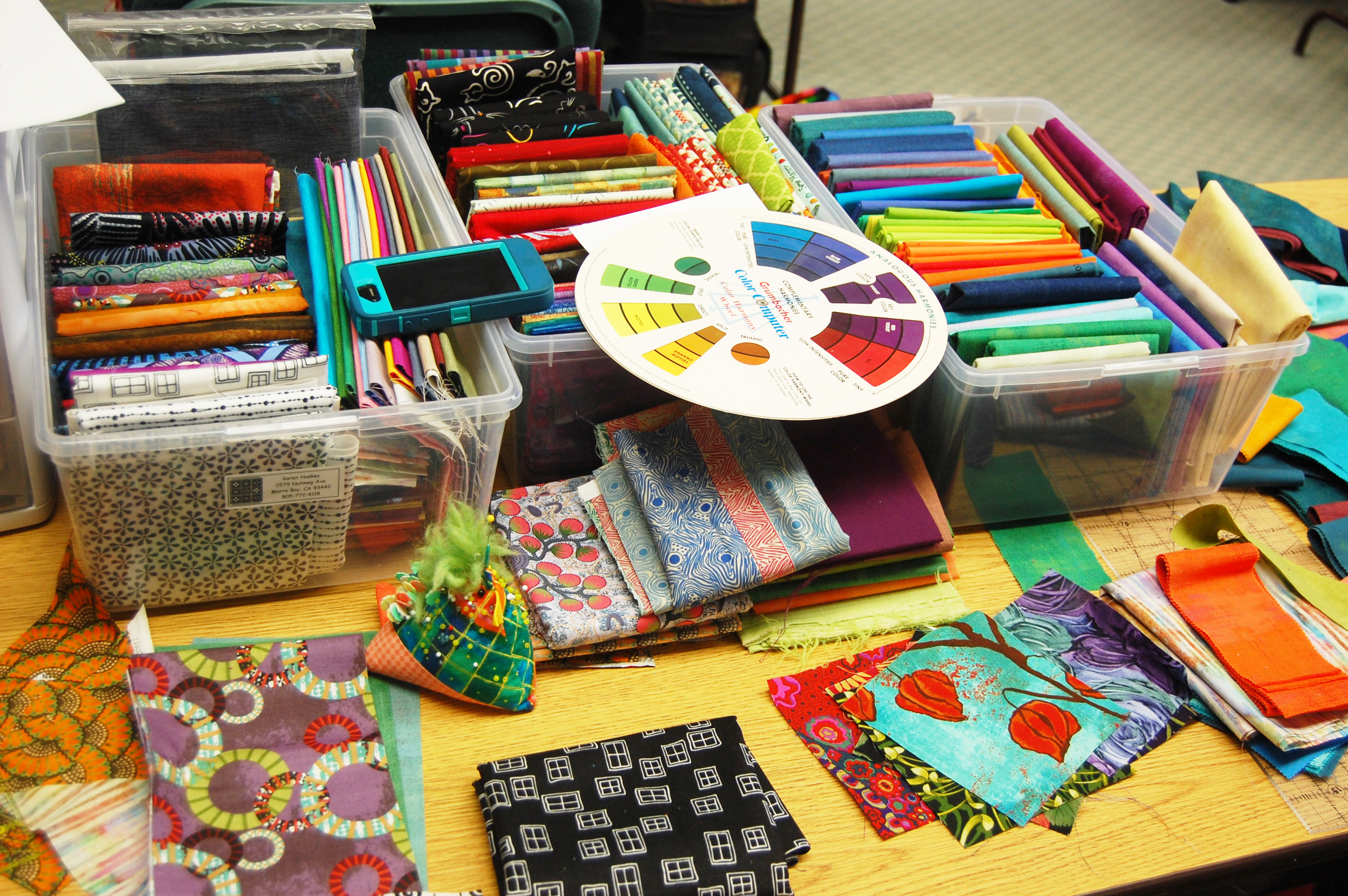
First, she who brings the most fabric . . . has the most to work with.

F Karen's table
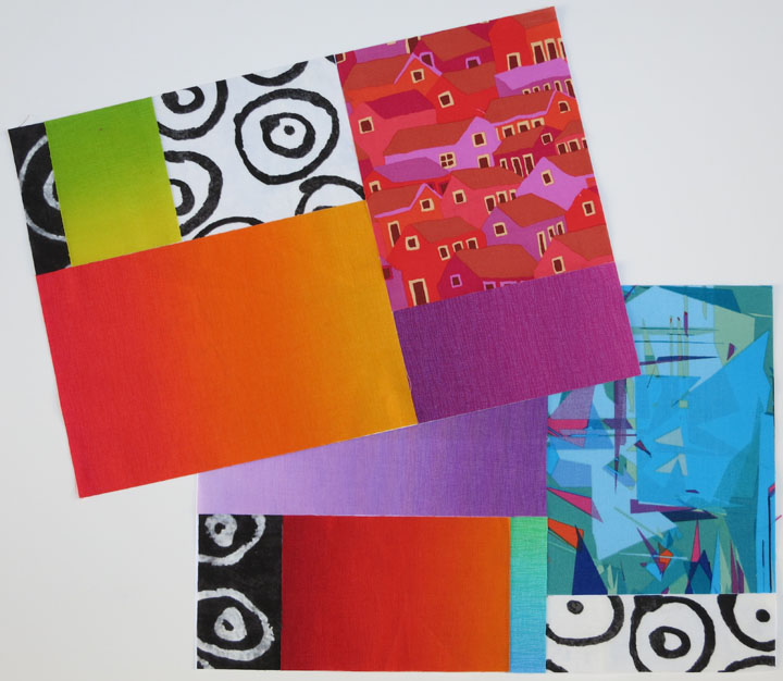
Below are some of the blocks Karen made with her yummy selection of fabrics. Note the “swizzle stick” borders, narrow strips of fabric inserted between the block segments.D1 Karens blocks copy
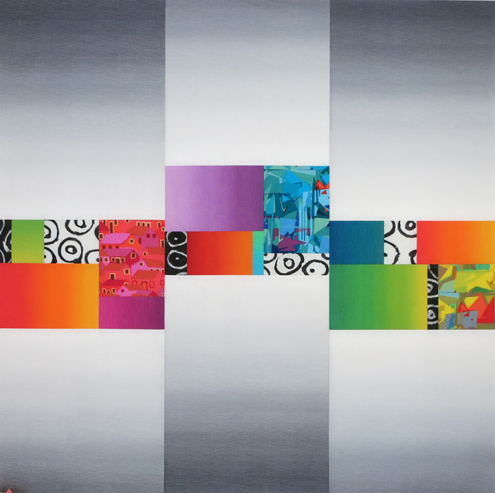
Luster exercises, starting with strips of gray ombré that I provided. How different the blocks look, depending on the choice of fabrics for the center units. Compare the lower left and lower right blocks, for example.A luster ex, largerEileen worked with a pattern she brought, with the idea of creating luminosity. C Eileen's blocksAs she played with her options, it became apparent that she was also creating transparency, almost by accident. A few days after the retreat ended, Eileen sent me a pic of her quilt top:K Eileen's finished top, transAren’t the bands of lighter-value yellow running horizontally through the quilt cool? She gets extra credit, for sure!

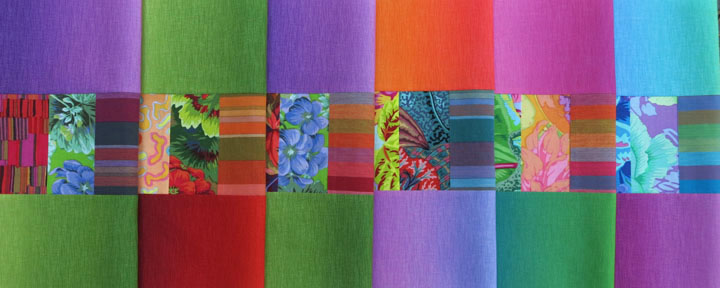
Nancy was also working with luminosity, and I’ll show you her finished quilt in a future post (no pressure, Nancy). Here she’s just relaxing. See how neatly her fabrics are piled at the front of her table? More extra credit. The fabrics choices pinned to the wall are Noelle’s, for her Sassy Circles quilt, but she somehow escaped the camera.I Nancy at her tableHere, Teresa begins to work with Serenity ombrés, Kaffe Fassett stripes, and Marcia Derse prints.G Teresa works with ombresAnd her blocks take shape. Note the center squares, cut on the bias. They’re a bit harder to work with, but they certainly add movement to the blocks.E Teresa's blocksMany thanks to Noelle, Nancy, Nora, Teresa, Karen, Jackie, Eileen, and Cindy. I can’t imagine my time there without you. (I wish I had taken more pics!) I really enjoyed meeting the students in the other classes and seeing their amazing work.

I’m adding this pic of the back of my vest because so many asked me about it. I pieced the vest back, with a green hand-dye on the outside and yellow-green osnaburg on the inside. What you see are the seam allowances, which I purposely put on the outside. The raw edges are bound with 1-inch strips of a Kaffe stripe cut on the bias. This technique is called the Hong Kong seam finish, and if you Google it, you’ll find plenty of videos and still tutorials.J back of my vest
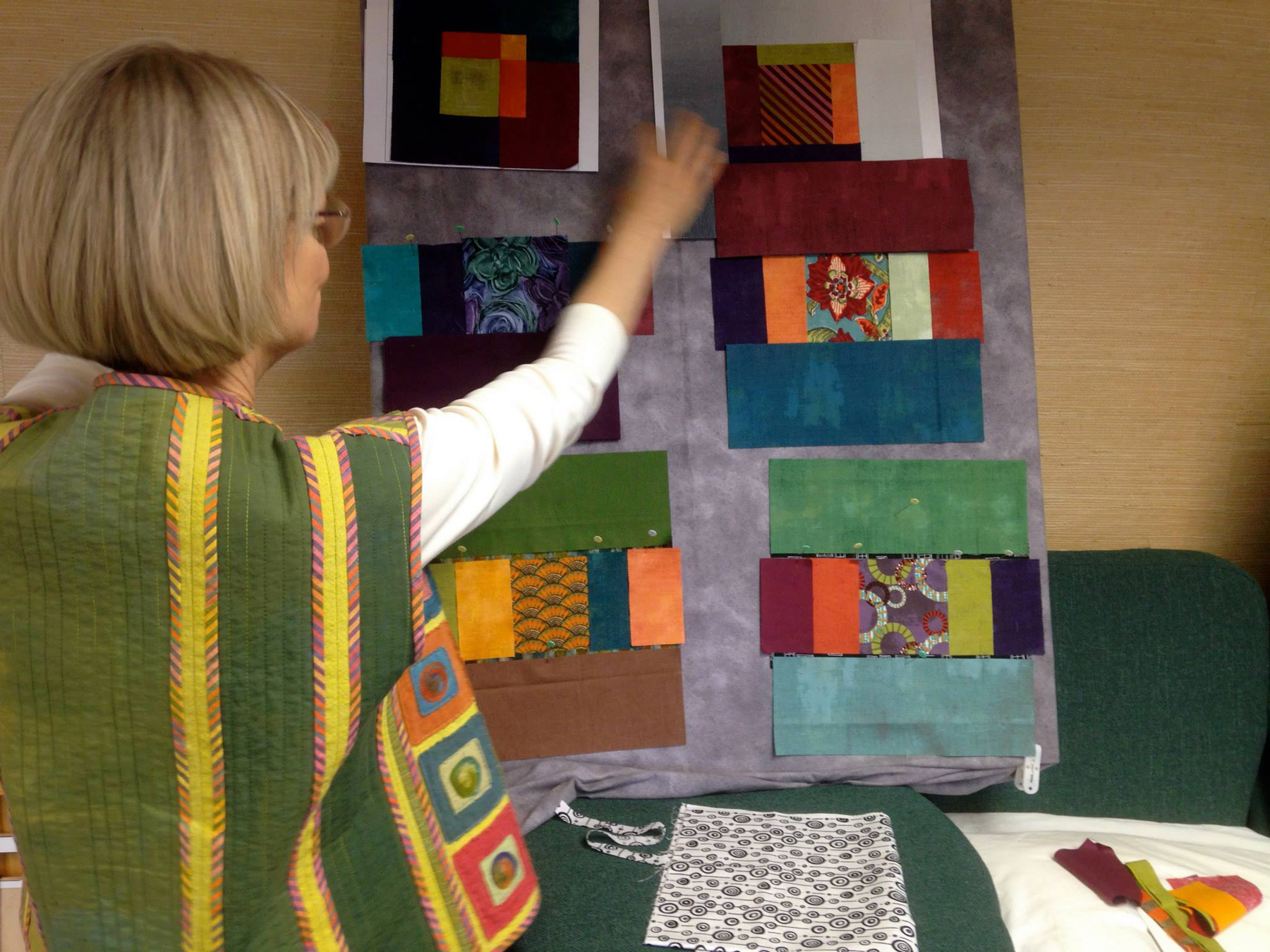
We’re working on plans for next year, and we’re very hopeful that we’ll be able to add that extra sewing day. I’m thinking about transparency, one of my favorite light effects. There are two kinds: parent/child and layered. Here’s an example of layered transparency, the illusion that lighter see-through shapes float above darker shapes. There will be a variety of exercises and three or four quilt design options.L Trans squares, bound-1
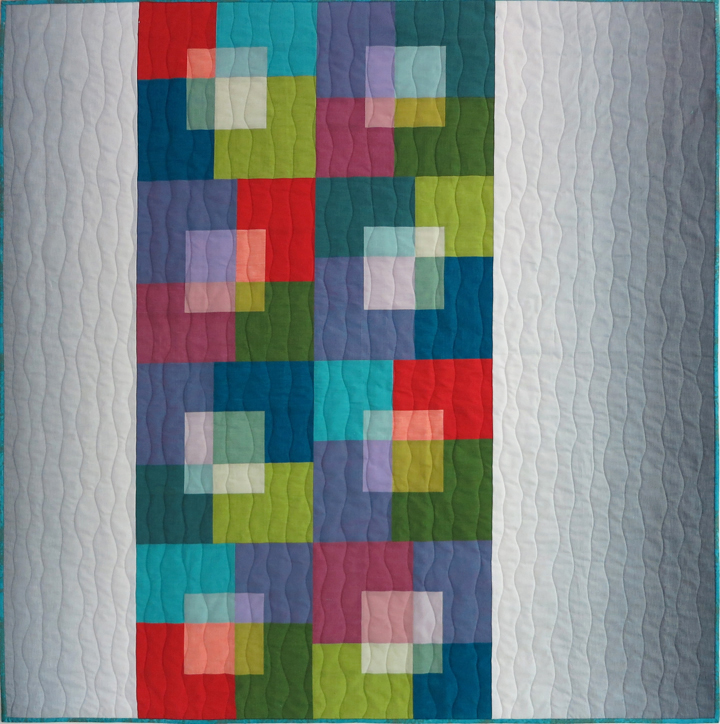
Finally, I left Zephyr and headed home up the west side of the lake. A stop at the Emerald Bay lookout is almost mandatory. Talk about “bright blue water,” with bits of greener blue.H Emerald Bay
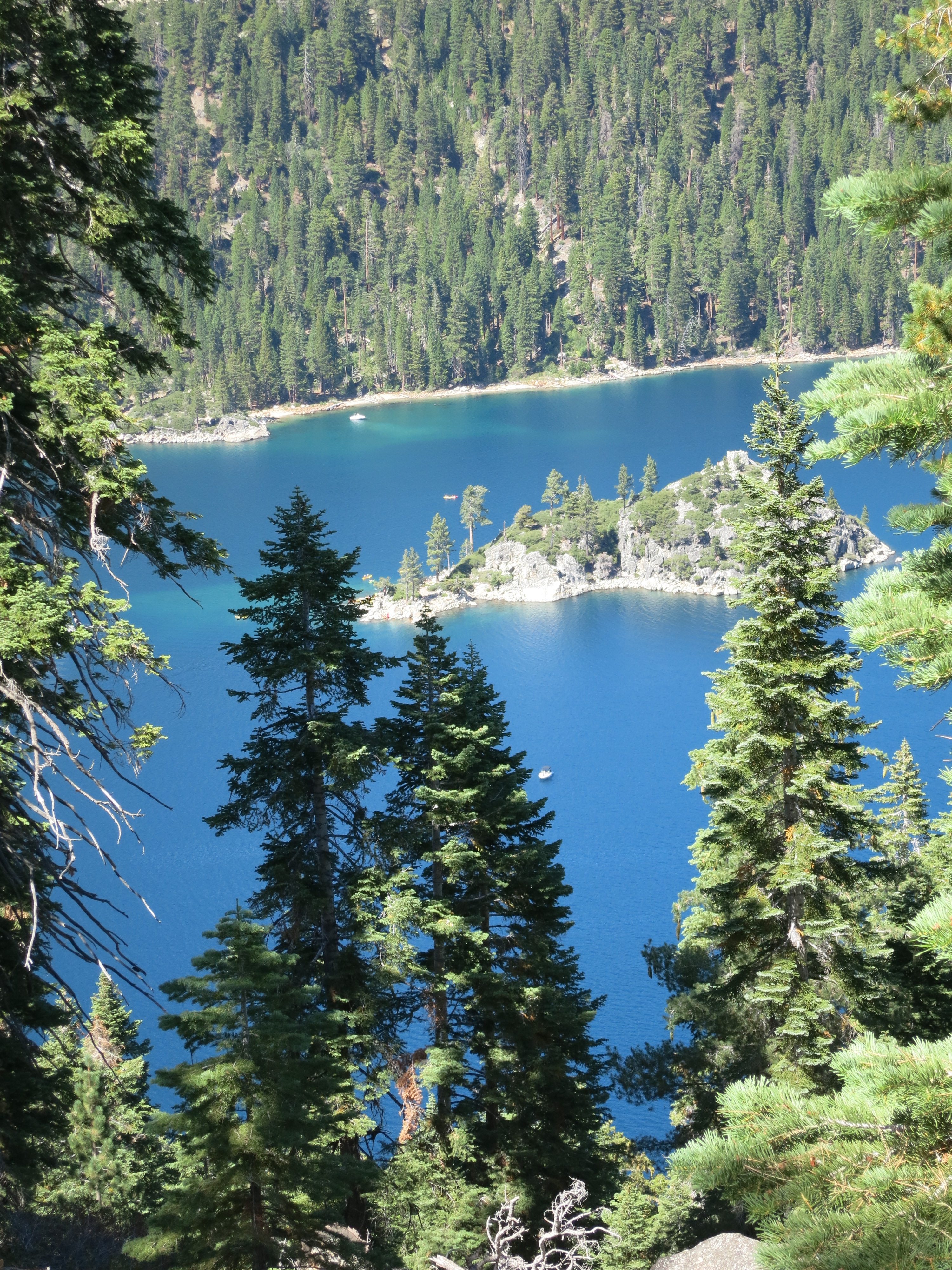
Until next time, enjoy these glorious October days and keep scheming and sewing. Is there anything better?!


Luminosity and Luster: A Watershed Moment

by Christine Barnes

Watershed horizontal sliceA warm hello to all! I had planned to show you the finished quilt from last month’s post, but I’ll save that for another time. With the retreat fast approaching, I wanted to create another quilt option, one that had both luster and luminosity. My goal was a graphic, easy-to-assemble design that showcases the amazing shift of light and color in the Gelato ombrés from E.E. Schenck.

Open and airy was the look I was after. I started by drawing a horizontal unit that measures 15 by 10 inches when finished. (I do my initial sketches on graph paper, not the computer, because I like pencil and paper. The less time on the computer, the better.)PrintPrinted fabrics are great with ombrés—they add pattern and an organic quality to a quilt design. I chose these three prints: a Kaffe Fasset houses design and two colorways of an Alexander Henry print. (It was love at first sight.)6 three prints The Marcia Desre fabrics below have been in my black-and-white bin for more than a year, waiting for the right project. I love the combination of B&W prints and intense colors—non-colors (black, white, and gray) make intense colors look even brighter and offer a bit of visual relief.5 Marcia Derse b&wBelow are the three units I designed, as mock blocks. I almost always do cut-and-paste blocks—they let you audition fabrics without the commitment of sewing.1 watershed, right unit2 other two unitsTo space out the units and suggest luster (light striking and moving across the surface), I called on my favorite gray, Gelato 714. I wondered, what if I staggered the pieced units? And what if I butted the light edges of the gray ombré against the edges of the pieced units? Here’s the result:

Watershed quilt topThe vertical sections of gray have luster, similar to the effect of the Serenity ombrés in my “Brushed Metal” quilt, another option for the retreat. The colored ombrés have luminosity and luster, thanks to their warm, intense colors and the gradations of color and value. I can hardly wait to see what magic Sandra works with her quilting. Heidi suggested the title of Watershed Moment because she said it reminded her of flowing water. I had my watershed moment when I understood how to use basic color concepts to create light effects like luster and luminosity. It’s too much fun!

I’ll have the gray and colored ombrés with me at the retreat, to play with or to purchase. (I’m also willing to share what I have left of the prints and black-and-white fabrics.) Come to Zephyr, bring you own colorful prints and B&W fabrics, and make it your own!


A Mind on Fire + Lustrous News

by Christine Barnes

Greetings, all! My mind is on fire with new ideas, the result of an inspiring five-day workshop with Rosalie Dace at Empty Spools Seminars, which are held at Asilomar, a conference center in Pacific Grove, CA. I’ll share that experience in my next post, once I’ve sorted my photos and and organized my thoughts. Amazing, just amazing!

But for this time, I’d like to share my completed “Brushed Metal” quilt and some fabulous fabric news. First, the news: The Gelato gray ombré, colorway 714, is back.

714a gray copy

This is the fabric I used in “Urban Ombrés,” below, one of the project quilts at our Zephyr retreat. Kits of the gray and all other fabrics except the black-and-white will be available.

Urban Om quilted 2 copy

The gray ombré had been discontinued, so I mounted a very small but very passionate email campaign, thanks to Heidi and Sandra, and guess what? E.E. Schenck decided to reprint it. Hooray! My web developer will have it back in my Store in the next few days.

Plans for the retreat are coming together nicely. I still have openings, and there are still lake-view rooms. “Brushed Metal” is another possible project for the retreat. It’s an example of luster, the illusion of light striking and bouncing off the surface. I used six Serenity ombrés, shown below. (The far left fabric is not in the quilt.)

Serenity kit for supp list copy

I oriented the ombré strips in each block so the light ends are going in different directions, to suggest the movement of light.

brushed metal MF lecture copy

Using the six ombrés, I designed three different blocks and made three of each. I also used Kaffe stripes and Marcia Derse prints. Many of these will also be available at the retreat. Here’s the quilt, beautifully quilted by Sandra:

Brushed metal for HOME quilted 10 at 72

I have a limited supply of the Serenity ombrés, but I’m setting aside enough kits of 10-inch strips for retreat students. If you’re not coming to the retreat and but are interested in the fabrics, let me know and I’ll put you on a list for any kits that are left over.

I only wish I had that amazing sashing fabric. It’s Japanese, from Back Porch Fabrics in Pacific Grove, and alas, it is long gone. Which leads me to my tip of the day, as if you needed to be told: When you see a fabulous fabric but have no idea how you will use it, buy it anyway. After all, we need to be prepared in case of a world-wide fabric famine!

So long for now. And do write with questions or comments. We love hearing from you. Christine


Christine’s Excellent Adventure with “The Quilt Show”

0a array of folded blocksWhile teaching at Sisters in 2012, “The Quilt Show” sent a small crew to interview me on color. As my “closest friends,” you can see the interview FREE starting today, April 6, and running through April 13. There will also be a slideshow of my work in the April 8 newsletter. Just click here to become a Basic (free) member and see the show. If you want to become a Star member, you can get a $5 discount using this coupon code: 266448288510. (Click the icon below to be taken to The Quilt Show home page.)

QSLogo15My segment is near the end of the show, following Kim Diehl’s in-studio presentation with Alex and Ricky. Her segment is great—I learned a new technique and loved seeing her work.

Recording the interview was a lot of fun, with more than a few surprises. (Safe to say, Hollywood is NOT knocking at my door.) Shelly, the producer, declared me a “one-take wonder” because I got through the main part of the segment without a mistake. Except, at the end I said, “back to Alex and Ricky in the studio.” Uh-oh, she said, they might not be in the studio; they might be on location. So we did the segment again, only this time I flubbed my lines. Sigh. Apparently, you can be a one-take wonder only once. But I had a great time, and Shelly and Lilo, the editor-in-chief, were wonderful to work with. Thank you, TQS!

What follows is a short visual series on luster and color. First, I’m happy to tell you that the gray ombré I love so much is being reprinted by E.E. Schenck. Yay! It’s one of the most graphic and versatile fabrics I’ve ever used, and I’m delighted that it will be available to my students (and everyone else) at the retreat.

But luster is also doable using bright, saturated colors. It’s the movement of light that suggests a lustrous surface, or sheen. I made the block below using three ombrés and a Kaffe stripe, but immediately decided it was too much of a good thing. There’s too much movement, and a quilt with blocks like this one could be overwhelming. How to tone it down but still make the most of the ombrés’ shfts in color and light?2 ombre luster only

I went back to the drawing board—that is, my fabric, and auditioned a Kaffe print. The geranium print below had the same range of green values as the green ombré. Yum!3 geranium vignette

More Kaffe prints and more auditioning led to a group of fabric vignettes.4 fabric vignettes

Here’s my new version. Notice that this block features the same two ombrés  as the original block. But the prints add some needed color, pattern, and viusal texture.5 retake of luster + prints

I’m not sure if I’ll ever make the quilt—you can see an array folded blocks at the start of this post—but I certainly enjoyed the process, and that’s what it’s all about.

I can’t think of a better place for you to enjoy your process and nourish your creative spirit than our Zephyr retreat. The setting is breathtaking, and every day you’ll be treated to color as only nature can do it. What could be better?!


Luminosity—a Very Special Effect

9a AA DecNew Year’s greetings from me, Christine, to all of you! I hope you’re enjoying (or recovering from) the holiday festivities and are looking forward to a fresh year. If you aren’t already relaxing, I invite you to do so now while I show you one of my favorite special effects, luminosity. In my first post I wrote about luster—the sense of light striking the surface from above or from the side. With luminosity, the light and warmth come from beneath the surface.

I stumbled on the concept of luminosity while playing with transparency. As I was working on a mock-block exercise, I said to myself, “Oh my gosh, that block looks, well, it looks luminous!” As I worked with the concept more, I came up with a luminosity recipe—when you surround a relatively small area of warm, medium-value, intense color with a larger area of cooler, darker, duller color, you can create the illusion of glow. I can’t begin to tell you how much quilters respond to this effect—when it works, we all say, “Wow!”

Let me begin by defining value, temperature, and intensity. Value is about how light, medium, or dark color is. Temperature is about how warm or cool color is; yellow, red, and orange are warm, while green, blue, and violet are cool. Intensity is about how bright or dull color is; neon green is intense, while sage green is low-intensity.

The three fabrics on the right below pulsate with warmth and light, making them great for creating luminosity. Surrounding them with the three fabrics on the left would enhance their luminosity.  (The middle two fabrics got into the act because I loved them.)OLYMPUS DIGITAL CAMERAWoven plaids like the one below look luminous on their own. When you fussy cut them to isolate the warm color, then surround it with cooler color, it’s as if candles burn brightly beneath the surface. 3 AA DecThe same woven plaid, in a different colorway, used just in the center of this block. (This image looks so soft because I framed the block using nonglare glass.)4 AA Dec“Airy” batiks are great for suggesting luminosity, and the colors can be a mix of warm and cool. The dappling in the center batik also suggests distance because a light-value fabric will recede when surrounded by a darker-value fabric.

5 AA DecLuminosity can be just about light, without the illusion of warmth. In this block, the lighter-value batik looks far away, as if you’re looking through a cut-out in a dark stripe square.

6 AA DecThis cut-and-paste block shows how a combination of different fabrics—woven plaid, woven stripe, batik stripe, and ombré—makes a luminous block more interesting. 8 AA DecAnd finally, sometimes it’s hard to differentiate between luminosity and luster. Look again at the pillow at the start of this post. Do the circles suggest light striking and bouncing off the surface, or light and warmth emanating from beneath the surface? (The circles are cut from a Caryl Bryer Fallert “Gradations” ombré, and the solids are Kaffe Fassett shot cottons.)

What about the blocks below, where the ombrés and Marci Derse prints switch places?0 AA Dec These are the things I love to ponder, and I hope you find them just as enticing. I’d love to hear what you want to learn about color. Let me know your thoughts, your questions, and I’ll explore them in future posts. The New Year is the perfect time to play with new colors and concepts. Let the creativity—and the fun—begin!