
Christine Barnes
I had the BEST time with the Village Quilters of San Diego last weekend! Thanks, ladies, for being so willing to try new ways to play with color. Not long into the day, I turned to one of you and said, “At what point did I lose control of this room?” It was a bit rowdy, but we had fun, didn’t we?
The workshop, “Modern Color,” was all about creating the graphic, light-and-airy look you see in modern quilting. We used both traditional and original formats, and fabrics typical of modern quilts—bold, contemporary patterns, solids, and “low-volume” background fabrics. (Low-volume as in quiet, usually light in value, with subdued motifs.) One of the most identifiable characteristics of modern color is the use of white space. I love the saying, “White space is breathing room for the eye.”
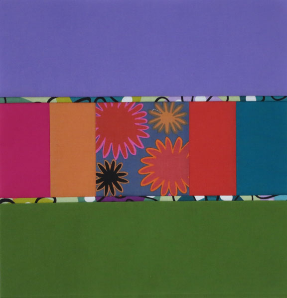
After I talked about the basic color concepts—they never change, no matter what your quilting style—we dove into the first exercise. Below is a traditional value placement with black-and-white triangles anchoring the design. (Imagine the four-patches you’d get where four blocks meet.) Here’s the same block, minus the triangles. (Pay no attention to the lines on the exercise sheet underneath.) Love the low-volume background fabric here.
 Another example using the same format, different fabrics:

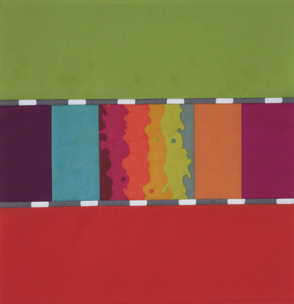
 In the example above, leaving off the triangles really puts the focus on the circles in the center. I like the simplicity, and the way the lines between the center square and background are blurred a bit.
Below are student blocks, by Carol and Karen. Keep in mind that these are quick cut-and-paste exercises—neatness doesn’t count. How different these blocks look, based on the values of the large triangles. I love them both! Wow, here are two designs that also look very different, thanks to value placement. Notice how much larger the upper block looks, almost like a snowball design, because of the “visual weight” of the black-and-white print. Love the balance of warm and cool colors in the lower block.
 I played with the same block, below. A large-scale, black-and-white check fabric for the rectangles gives the design an asymmetrical look.
 We also worked with the block from my Urban Ombrés quilt. I supplied strips of gray ombré to surround the center units—like white, neutral gray gives your eye a place to rest. (The black-and-white fabric in the right block will soon be in my website Store.)
 Two more examples, so different yet so effective!
 We did one more exercise, but yours truly was too busy gabbing to take photos. Trust me, there were some great blocks. I’ve said it before: it’s so much fun for me, as a teacher, to see what all of you come up with. You continue to amaze me.
Looking ahead (and into my stash), I’m thinking solids and plaids for my next quilt. I knew there was a reason to acquire and stockpile all those yummy plaids.
 Finally, I’ll be in Mendocino having Thanksgiving dinner with my aunt and uncle. I took this photo on the garden tour in June. The coast doesn’t look like this in November, but I fell in love with the layered colors of the heather and thought of this pic when I was going through my plaids. Sort of fits the season, don’t you think? Wherever you are, have a great time with family and friends. It’s my favorite holiday.


 T
T


