by Christine Barnes
Summer greetings, AA followers! If you saw my last post, you may remember the blocks I was working on for my next quilt. They feature mostly solids, with patterned center squares. I inserted “swizzle-stick” borders to add a bit of color and sparkle to two of the blocks, below.
 In this block, the gray-and-white polka dot fabric looks like a stripe.
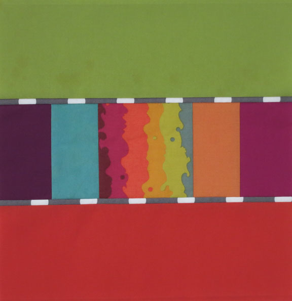 I decided to add sizzle-stick borders to a third block, below. This white-and-black fabric is a companion to the Kim Schaefer print in the center.
 Then it was time to think about how to space out the blocks. I’ve never been a big fan of sashing in traditional quilts—I prefer the patterns formed by block-to-block designs to sashing between blocks. But I’m learning to love sashing, as you may have noticed in my “Brushed Metal” quilt. Wider sashing puts the focus on the blocks, and when the sashing is lighter in value, it recedes.
I love, love black-and-white polka dots, so of course I had try a dotted fabric, below. (BTW, the colored squares above my design board are painted on the wall. It’s a long story. . . .)
 But right away my eye went to the seam where the dots blend into one black blob. I measured the repeat pattern and realized there was no way I could avoid chopped-up dots. Adding cornerstones to the sashing seemed like a good idea.
I found a wonderful smaller-scale black-and-white dot at The Cotton Patch in Lafayette, CA. But these gray-and-white cornerstones made the quilt look flat, with no sense of depth I got brave and decided to try black-and-white four-patches, below:
 I like the single chain the four-patches imply, but they seem a bit large. If I go with this option, I will align the dot design, to suggest that the pattern flows beneath the blocks.
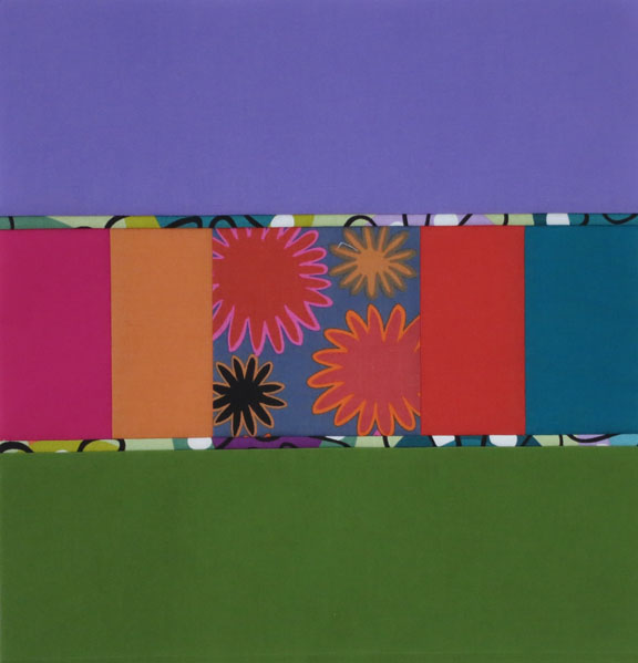
Next, I decided to simplify the design with this funky-flower print, one of my all-time favorites. Just like the large polka dots, the pattern is chopped up, but when the design is this random, it isn’t as noticeable. And now, the blocks appear to be suspended above the background, an effect I really like. I’m still mulling over the options, and I’ll show you the quilt when it’s finished. Until then, I hope you’ll consider sashing. Experiment with lighter- and darker-value fabrics—lighter values make the blocks float, while darker values make the sashing and blocks blend, as if they are on one plane. Which proves the adage, “Audition, audition, audition.”
We’ll be doing plenty of auditioning in my Artistic Alchemy workshop, “Luminosity and Luster: Playing with Color and Light.” There’s simply no way to predict how colors and patterns will interact until you cut them up and make mock-blocks. It’s an eye-opening process, and I promise you’ll soon become a convert to this way of working.
Stay cool and keep quilting!