
by Christine Barnes
Last weekend I drove 200 miles north to Weaverville, home to an active art community and my long-time friends Evelyn (an amazing watercolorist) and John Ward. This is my second show at Main Street Gallery, and besides being a lot of fun, it was fascinating to hear the comments from people who expect quilts to be traditional. I thought you’d enjoy hearing what others think—and wonder—about quilts.
“Wow!” was the comment I heard most as people walked through the door. When we were hanging the quilts, I asked if we could put the more colorful quilts on one wall and the less intense ones on the opposite wall. I call it “a color connection,” when fabrics or quilts have related colors but don’t match. To my eye, they seem harmonious without looking overly planned.
Here are several views of the colorful wall. Forgive the less-than-fabulous photos—I was so busy helping Evelyn hang the quilts that I didn’t take much time with photos. And I didn’t get a single shot of the reception because I was busy talking. Sheesh! 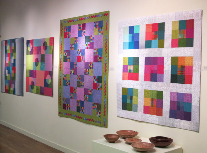 Evelyn and I met when we both worked for an ad agency in Sacramento. I was an intern and a total rookie, but it was a great job because we became friends. After long careers in publishing, we’re both so happy and grateful to be doing what we love. Good for us!
 About the two transparency quilts above, I was surprised at how many people were drawn to this effect, and how curious they were to know how to create it. It’s really all about choosing the right values and keeping the intensity of the colors consistent. The term “shot cotton” (a fabric woven with different-colored warp and weft threads) drew a number of questions, too.
 Black and white—always a winner! We hung the quilt above and my color wheel side by side because they both have bright colors, and each has black.
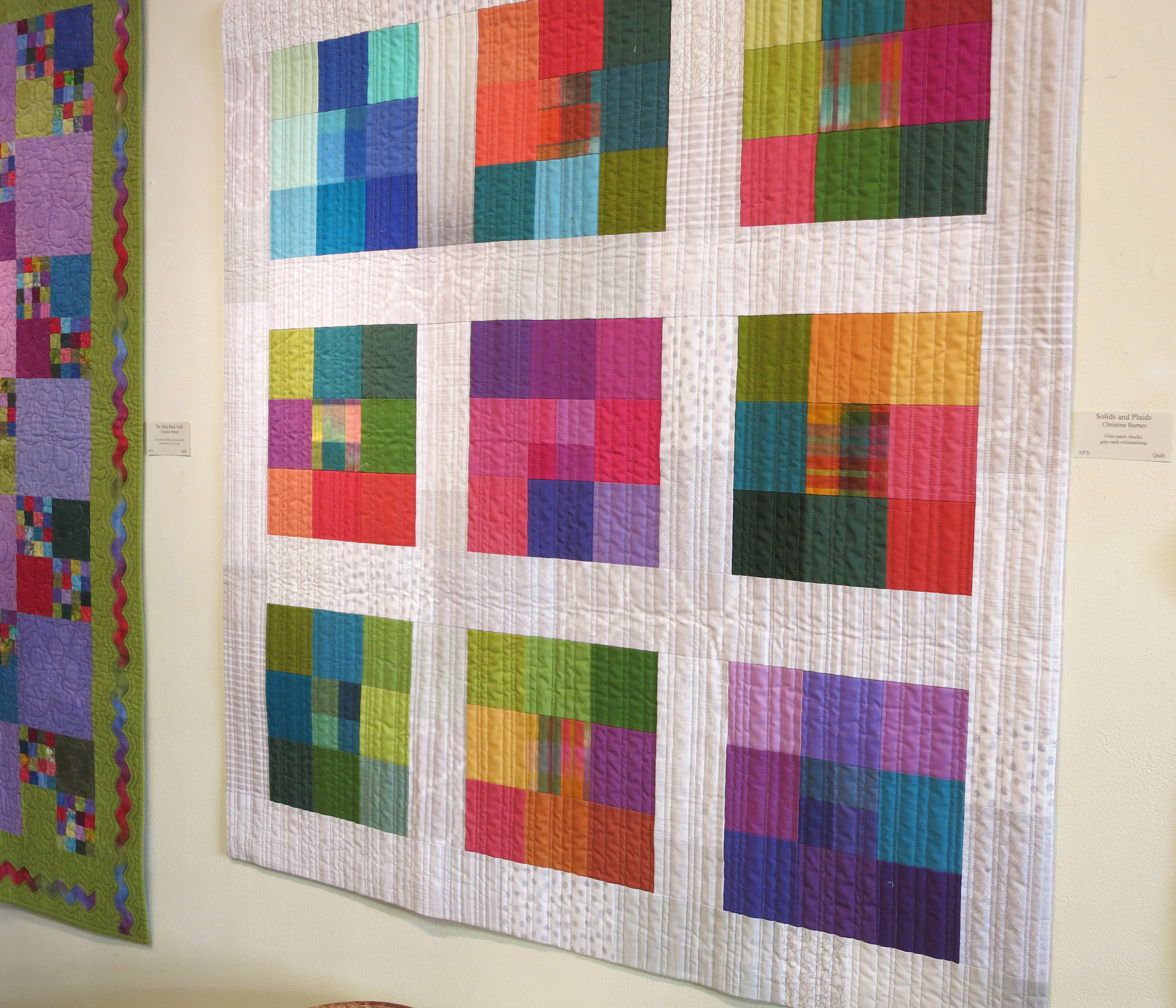 I wanted you to see Sandra’s quilting in “Solids + Plaids,” above. Thank you, Sandra!
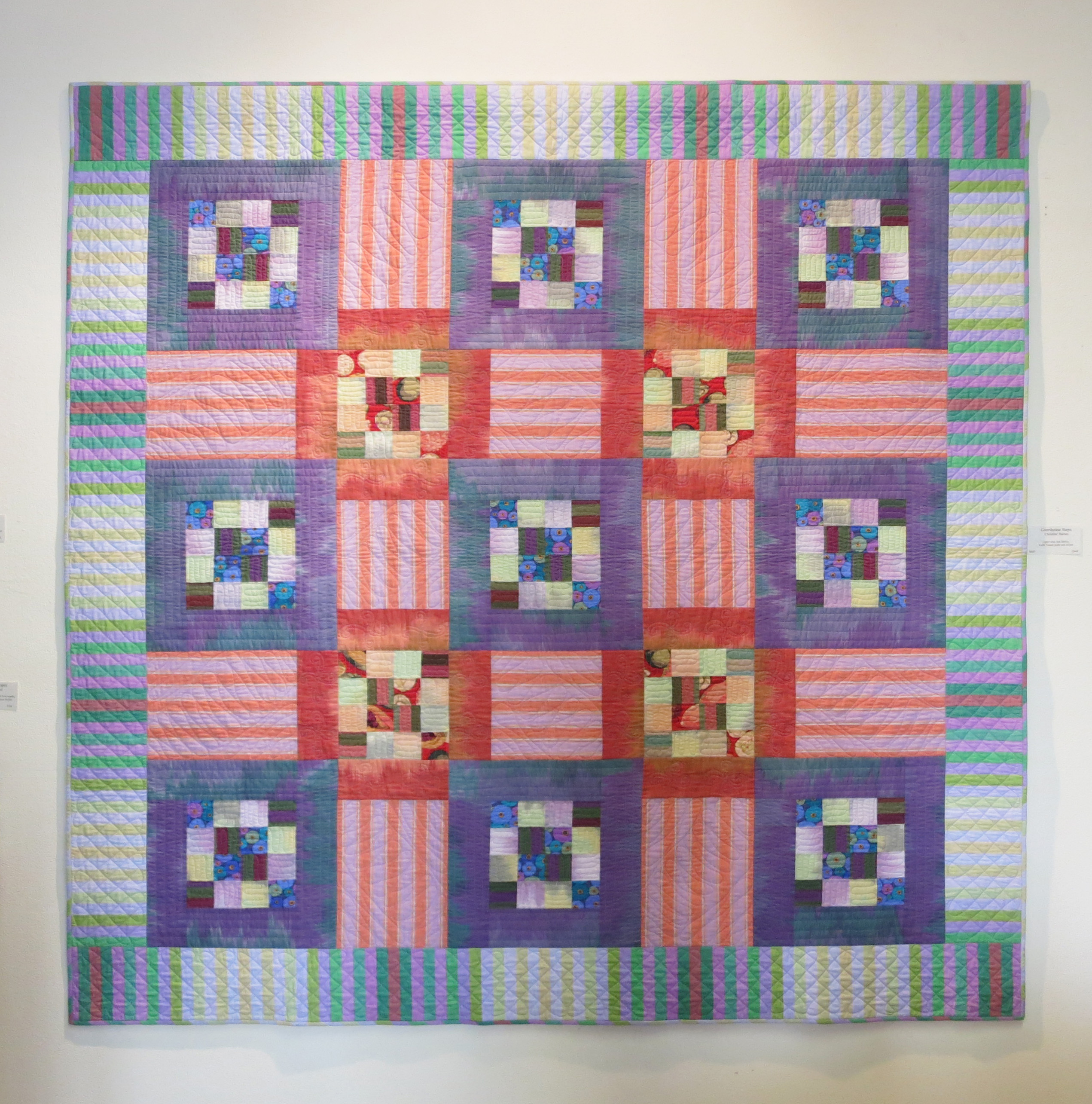
“Puss in the Corner on the Courthouse Steps” is a combination of two traditional designs, but it has lots of contemporary fabrics—ikats and prints from Kaffe Fassett and opalescent stripes from Michael James. I was happy to hear comments about the sense of depth, a feeling of layering, in this quilt. Hey, I thought, they get it!
 On to the more neutral wall. “How do you choose your fabrics” was probably the most-asked question, followed by, “Where do you find these fabrics?” Those questions really reinforce my belief that different kinds of fabric—woven stripes, ombrés, Japanese prints—make a quilt more interesting.
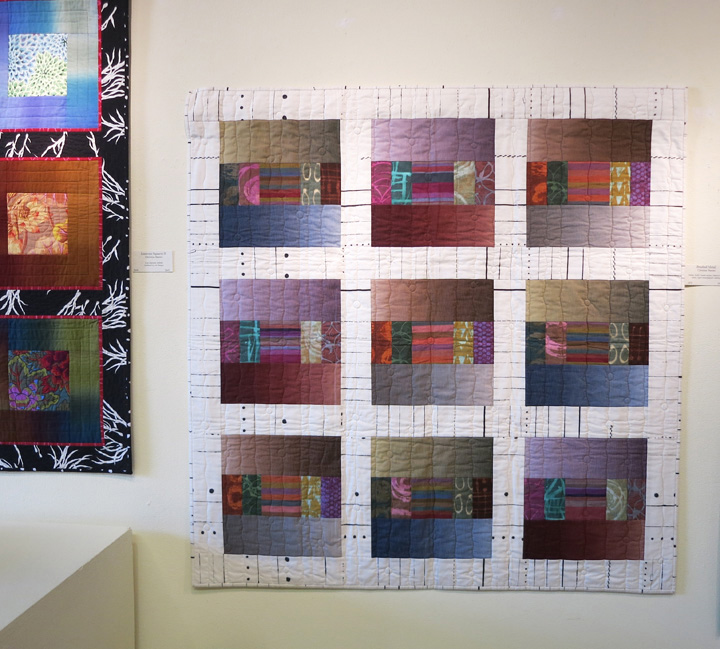
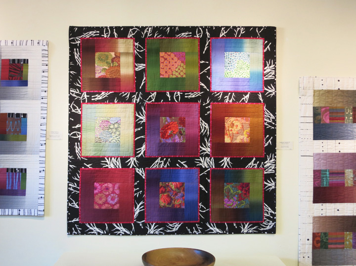
 We hung the framed nine-block piece below next to “Urban Ombrés” because of their black-and-white connection. Ombré fabrics were new to just about everyone.

 People noticed the sashing, though the term was unfamiliar, in quilts like “Brushed Metal,” above, and “Lustrous II,” below. “How did you decide on that black-and-white print?” I told them I tried at least six different fabrics for the sashing, and to my surprise, this was the one. Bold and busy as it is, this print still reads as background, and the blocks seem to float. (The narrow red flanges help, too.)
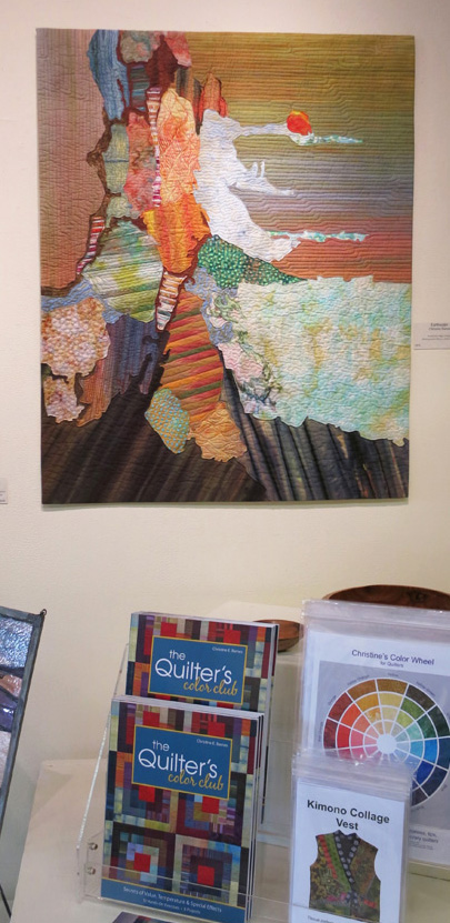
 “How do you know how you’re going to quilt something like this?” was the question about “Earthscape,” below. I had to admit that I didn’t do the quilting (Carol Walsh did a phenomenal job with it), but it was fun to point out the different shapes and textures she created with thread. More than a few people asked about Elin Noble’s handpainted fabrics in the upper areas. “You can paint fabric???”
 “Well, these aren’t like any quilts I’ve seen” was my favorite comment. It was fun to watch people begin to see color and quilts in a different way. Some told me about quilts in their past and how much they meant to them. That’s what keeps us quilting, the memories they evoke and the people who made them.
Finally, I’m teaching my “Color Made Modern” workshop at Sugar Pine Quilt Shop October 24-25. Contact me for details, or call the shop at (530) 272-5308. I’ve taught this class a number of times, locally and far away, and it’s become my favorite workshop. Come to find out why!
I hope you’re enjoying glorious fall weather, as we are here, and finding time to create and sew.

Hi Christine, this is one of my favorite posts. Keep up the good work. The Gallery shows off you work beautifully. Linda K. Johnson, aka Crafty Ol’ Broads.
Hi Linda, thanks for your comment! Doing a gallery show is interesting because nowhere else do you see your quilts together, and in a venue with nice lighting. Talking to the people who come is the most fun, and you can never predict what they will ask or tell you. Hope all is well with you and your sis!
Christine, come to NH to teach a class!
Well, that sounds like fun! Especially at a time when the leaves are turning . . . Thanks for your comment!
Christine, it was so interesting to read your post, to hear from the point of view of the people who came to your show, and to hear their questions. I think you got a lot of people’s little grey cells working! Good work and congratulations!
Christine what a wonderful post! Your photographs are beautiful. I LOVE Puss in the Corner of The Courthouse Steps! It literally vibrates with color! How fun to be in a gallery. What a lovely setup too!
THE FIRST PAGE IS SO BEAUTIFUL! HOW YOU GET THAT MIX IS BEYOND. I HAVE YOUR BOOKS AND READ EVERYTHING YOU WRITE BUT IT STILL ELUDS ME (sp)
Thanks, Dolores! The best way to learn about color is to practice, because it’s more about practice than talent. Any chance you can take a color workshop? I teach color using mock-block exercises (cut and paste, with fabric). They show in an instant what works and what doesn’t, and you learn a lot from the other students. And it’s FUN!