Cheers! (And Nice News)

by Christine Barnes

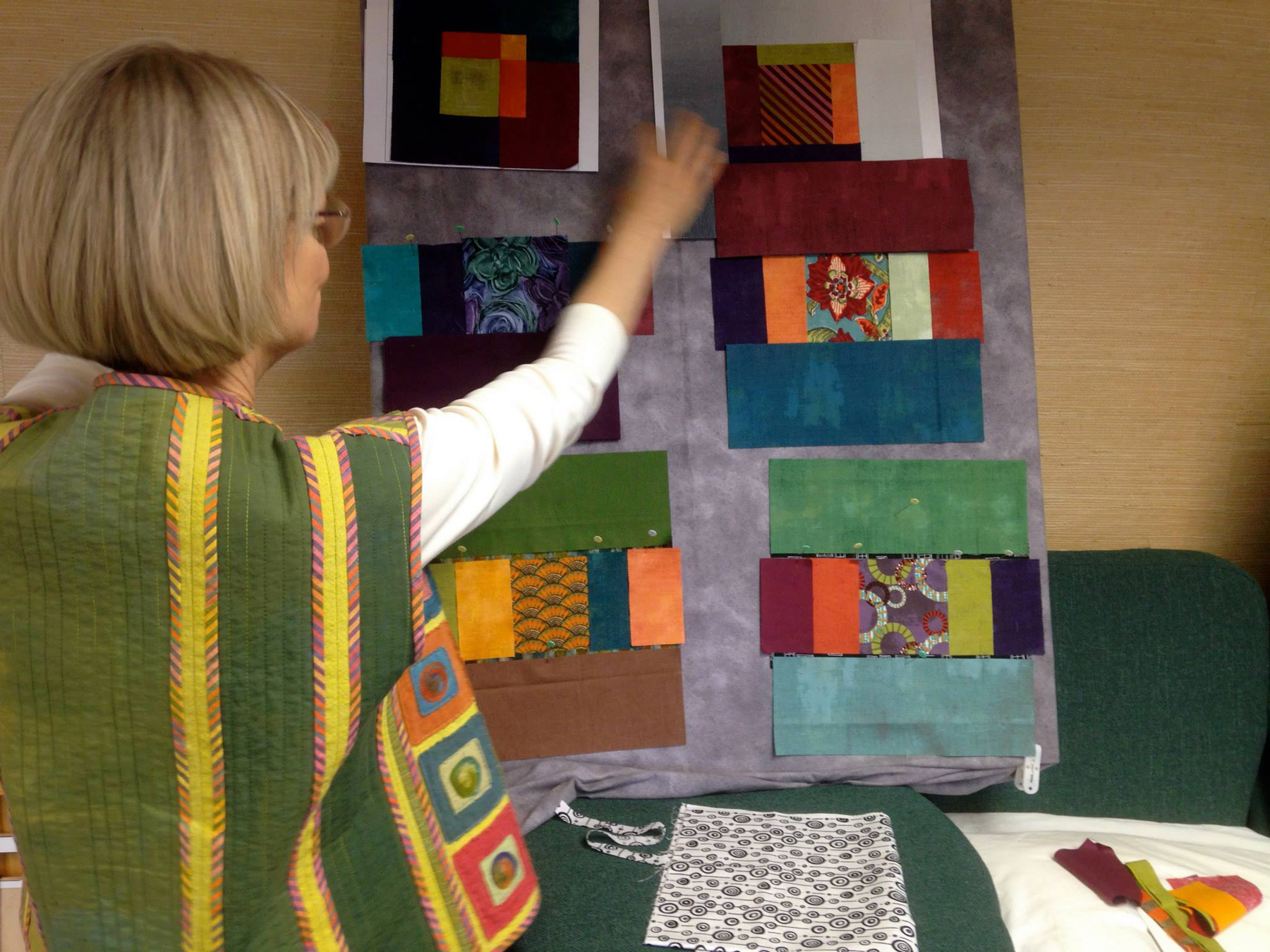
First, we have good news to report on Sandra: no need for surgery. The ortho doc says it will take time, but she is in good spirits and already has a bit of mobility in her left arm. Each of us has seen her, and all things considered, she looks great. So, raise a glass (or in the case below, a vase of my favorite ornaments) to Sandra—keep mending!ornaments 3 copy
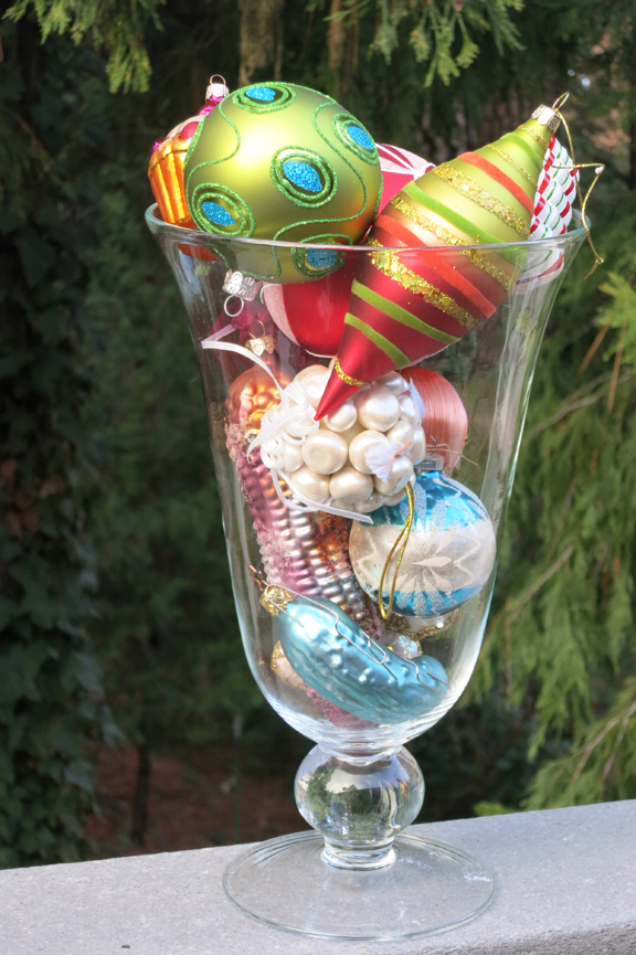
Me, I’m happily re-organizing my life, starting with my sewing room. It feels SO good to make progress, and in the process I’ve unearthed buried treasure in the form of blocks I had fun making, but haven’t used yet. In no particular order:

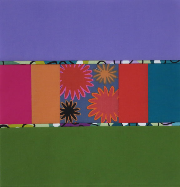
For several years I made 20-inch pillows as gifts. This pillow top was supposed to be finished with 4″-wide green velvet borders. The angel fabric in the center came from Heidi’s fabulous fabric store, back in the day.Xmas pillowUsing the same format, I made a woodsy block that I planned to frame. It’s a great format for working with value to create a sense of foreground/background.Woodsy block
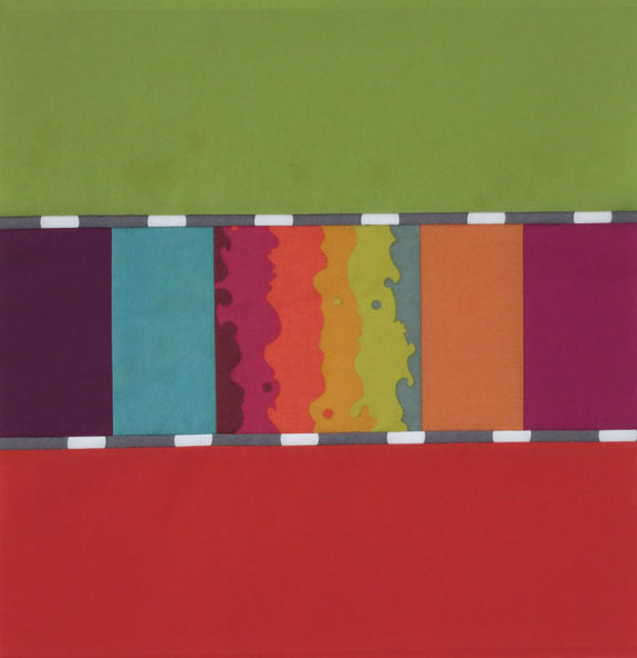
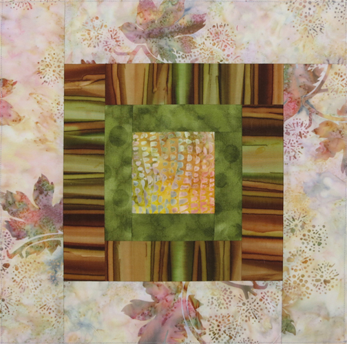
Love the rich “lodge” colors of the ombré in this 12-inch block. Add a Kaffe print and a yummy batik . . . Lodge hot pat
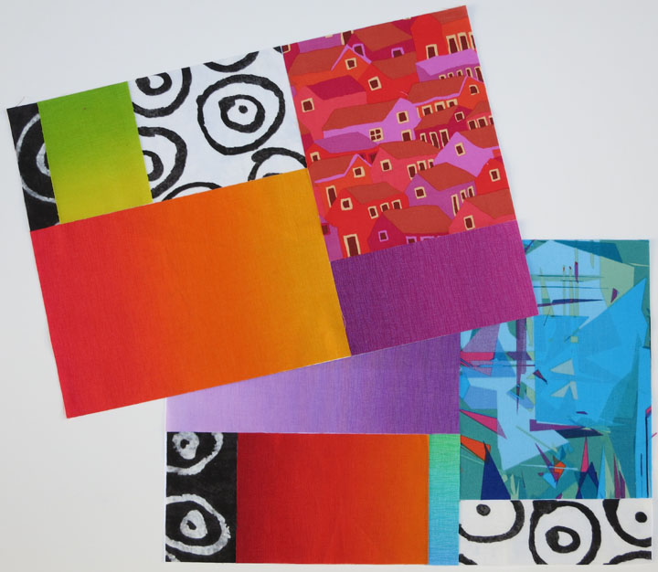
Then there was the Kaleidoscope class taught by Jan Soules at Pine Tree Quilt Guild. I still need that 12-step program for pattern addicts because as you can see, I can’t help myself. This was the first of two blocks I made. I plan to make more, honest.Spider Web, Jan S.
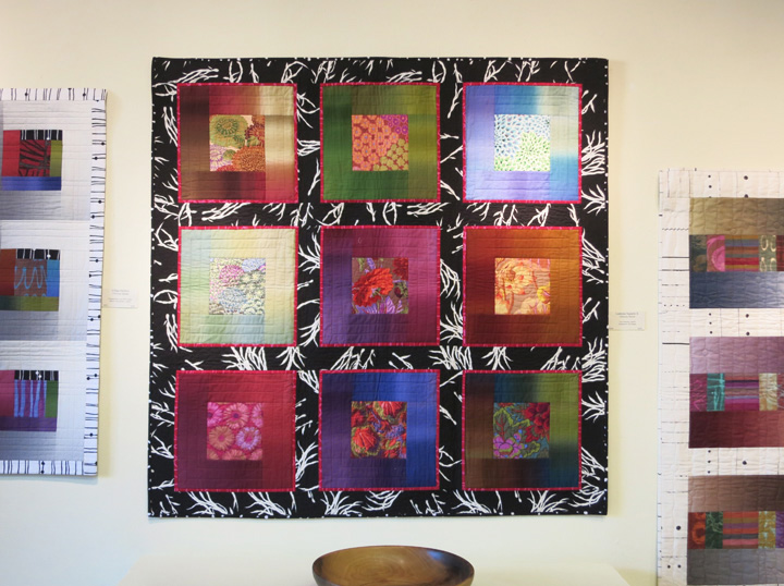
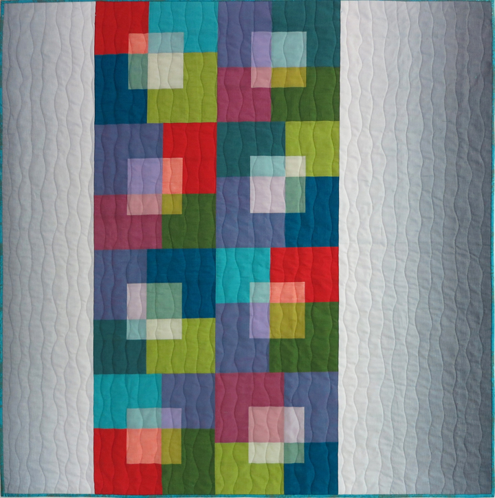
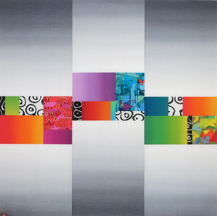
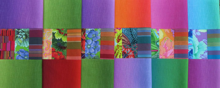
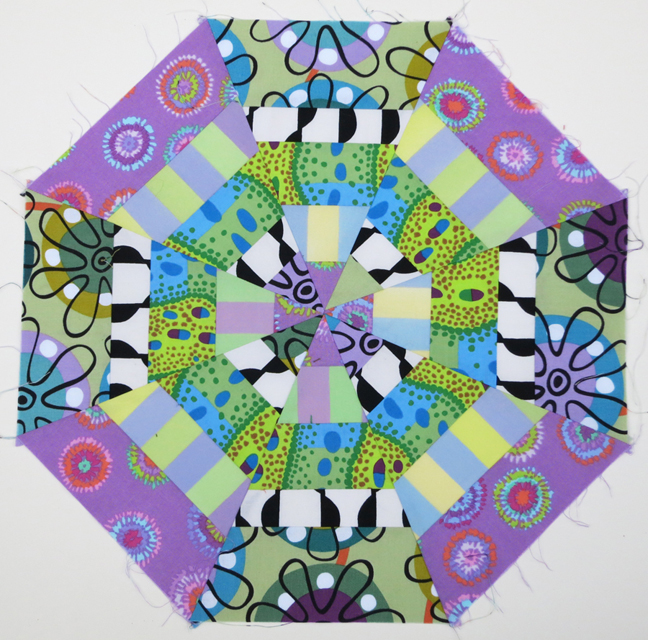
As you well know, I love, love the combination of Kaffe stripes and prints with ombrés. This block didn’t make it into my Lustrous Squares II quilt, but I think it has a future as a pillow top. It’s 16″ square.Chard
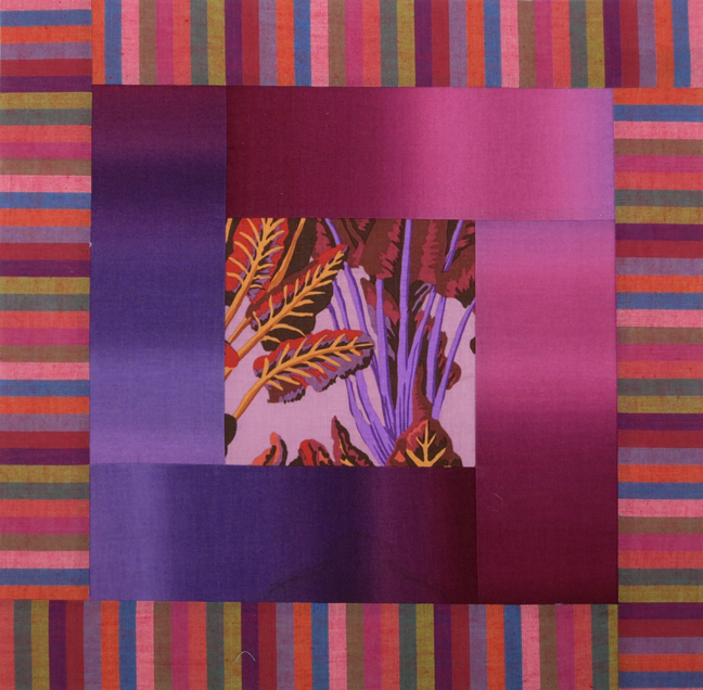
Finally, I’m happy to tell you that my “Swizzle Sticks” quilt, which you saw in various stages, is in the latest issue of American Patchwork & Quilting. Here’s how they styled the shot that went with the article. (Used with permission from American Patchwork & Quilting® magazine. ©2015 Meredith Corporation. All rights reserved.)styled APQ coverBy coincidence, the quilt on the cover, by Marcia Harmening, features two of the Gelato ombrés I’ve used in so many of my projects. Small world.APQ0216_DIG1HR_600That’s it from me for now. I hope your days are merry and bright, and that they include time to plan (if not start) a quilt or wearable or other project you’re wildly passionate about. Cheers!


My Gallery Adventure in Color

by Christine Barnes

Last weekend I drove 200 miles north to Weaverville, home to an active art community and my long-time friends Evelyn (an amazing watercolorist) and John Ward. This is my second show at Main Street Gallery, and besides being a lot of fun, it was fascinating to hear the comments from people who expect quilts to be traditional. I thought you’d enjoy hearing what others think—and wonder—about quilts.

“Wow!” was the comment I heard most as people walked through the door. When we were hanging the quilts, I asked if we could put the more colorful quilts on one wall and the less intense ones on the opposite wall. I call it “a color connection,” when fabrics or quilts have related colors but don’t match. To my eye, they seem harmonious without looking overly planned.

Here are several views of the colorful wall. Forgive the less-than-fabulous photos—I was so busy helping Evelyn hang the quilts that I didn’t take much time with photos. And I didn’t get a single shot of the reception because I was busy talking. Sheesh! 3 color wall 3Evelyn and I met when we both worked for an ad agency in Sacramento. I was an intern and a total rookie, but it was a great job because we became friends.  After long careers in publishing, we’re both so happy and grateful to be doing what we love. Good for us!

5 Evelyn and me About the two transparency quilts above, I was surprised at how many people were drawn to this effect, and how curious they were to know how to create it. It’s really all about choosing the right values and keeping the intensity of the colors consistent. The term “shot cotton” (a fabric woven with different-colored warp and weft threads) drew a number of questions, too.

7 Lustrous I + color wheelBlack and white—always a winner! We hung the quilt above and my color wheel side by side because they both have bright colors, and each has black.

10 plaid + solid, closeI wanted you to see Sandra’s quilting in “Solids + Plaids,” above. Thank you, Sandra!

“Puss in the Corner on the Courthouse Steps” is a combination of two traditional designs, but it has lots of contemporary fabrics—ikats and prints from Kaffe Fassett and opalescent stripes from Michael James. I was happy to hear comments about the sense of depth, a feeling of layering, in this quilt. Hey, I thought, they get it!

11 puss, crookedOn to the more neutral wall. “How do you choose your fabrics” was probably the most-asked question, followed by, “Where do you find these fabrics?” Those questions really reinforce my belief that different kinds of fabric—woven stripes, ombrés, Japanese prints—make a quilt more interesting.

8 neutral wall 3We hung the framed nine-block piece below next to “Urban Ombrés” because of their black-and-white connection. Ombré fabrics were new to just about everyone.

9 offbeat

2 brushed stragiht onPeople noticed the sashing, though the term was unfamiliar, in quilts like “Brushed Metal,” above, and “Lustrous II,” below. “How did you decide on that black-and-white print?” I told them I tried at least six different fabrics for the sashing, and to my surprise, this was the one. Bold and busy as it is, this print still reads as background, and the blocks seem to float. (The narrow red flanges help, too.)

6 Lust II only“How do you know how you’re going to quilt something like this?” was the question about “Earthscape,” below. I had to admit that I didn’t do the quilting (Carol Walsh did a phenomenal job with it), but it was fun to point out the different shapes and textures she created with thread. More than a few people asked about Elin Noble’s handpainted fabrics in the upper areas. “You can paint fabric???”

4 earthscape“Well, these aren’t like any quilts I’ve seen” was my favorite comment. It was fun to watch people begin to see color and quilts in a different way. Some told me about quilts in their past and how much they meant to them. That’s what keeps us quilting, the memories they evoke and the people who made them.

Finally, I’m teaching my “Color Made Modern” workshop at Sugar Pine Quilt Shop October 24-25. Contact me for details, or call the shop at (530) 272-5308. I’ve taught this class a number of times, locally and far away, and it’s become my favorite workshop. Come to find out why!

I hope you’re enjoying glorious fall weather, as we are here, and finding time to create and sew.


Everything’s Coming Up . . . Circles?

by Christine Barnes

Happy summer! It’s not yet summer by the calendar, but the longer days and warmer temps make me feel ambitious, which leads, hopefully, to new ideas and projects. Yes!

Before I get down to business though, I wanted to mention that a spot has opened up in my Transparency workshop at Zephyr. Interested? Check out the retreat details here and scroll down to see the samples and supply list.

Shadowed-circle quilts are fun, too. They’re a “home run” in my book because they have the cohesion of a repeat-block design, with the variation of different colors and prints. The constant—the shadow—unifies it all. For “Sassy Circles II,” below, I “went radical” and made black-and-white striped shadows. (Check out my Gallery for three other circles quilts.)

Sassy Circles II @ 10 in.

Since then I’ve played with lots of different shadows. The first two blocks below have shadows cut from opposite colorways of the same fabric design. To my eye, the mostly white shadow looks larger than the mostly black one, but they are the same size. I love the square dots in the third block. White fabrics don’t look like shadows exactly, but they’re fresh, and they add an element of surprise.Three shadowed circles AA FINAL

What follows are pics I took in workshops in Elk Grove and San Luis Obispo, CA. Given the time that has passed, I’ve forgotten names, but I thank all my students for sharing their work.

The circles below were cut from different areas of the same print, and the background triangles were cut from Serenity ombrés. 1 serenity + harvest printKaffe Fassett prints and colorful ombrés are a winner.3 nice! coll of KafffeOther kinds of fabrics make great background squares. These soft stripes really lighten the mood and say “candy” to me.4 stripe bkgrd, KaffeThe shadows in these blocks were cut from one multi-colored Japanese stripe. And what fun, a baby quilt of circles! 5 SLO zoo animalsWhat’s interesting about the blocks below, besides their yummy pattern and color, is that the upper right and lower left background squares were created from two squares of the same ombré, right sides together. The shifts in value and color in the ombré yield two very different squares.

7b Irene?Instead of cutting the triangles for each background square from one fabric, Patti mixed up the ombrés. I like the quirkiness, the unexpected combinations.9b Patti blocks agaiI tell my students they get “extra credit” for using stripes, like the black-and-white pin stripe below. The pieced circle at the top is a “bonus circle” that’s created when you trim the layers from the wrong side. I see potential for transparency here . . . .12 striped shadowsWhite shadows may not give you the dimension of black shadows, but they do provide visual relief. I love, love these floral prints.13 2 blocks with dotted shadowThe island print below is a stylized take on more naturalistic floral prints. From a distance, this block is dynamite. 14 YUMMY on Y-B-G ombre

And finally, wow, look at these bold shadows. Linda also cut triangles from various ombrés for some unique color combinations. And she did a fabulous job of centering the motifs in the circles. Well done!15 YUMMY B&W striped shadows

That’s it for now. I hope you’re seeing new possibilities with circles and shadows. A huge THANK YOU to all of my students for the enthusiasm and willingness to learn that you bring to each class. You make this job so much fun!


A Tale of Two Quilts (and a bit of transparency)

by Christine Barnes

New fabricsThe image above has nothing to do with this post, but I just had to drop it in because I LOVE these fabrics by Marcia Derse, Alison Glass, and Kaffe Fassett. You’ll see some of them again in a future quilt or garment.

Now, to the business at hand: Have you ever worked on a quilt that wasn’t quite “working,” yet you continued because you hoped it would get better? That’s what happened when I started my quilt Urban Ombrés. It began with the block below. I cut the center rectangle from a lighter ombré, and the surrounding strips from darker areas of other ombrés, all from Caryl Bryer Fallert. (The black-and-white is by Kim Schaefer and isn’t available, even on the Internet.) I thought the block was lovely, very ethereal and serene.

1 single block, all ombre Ah, but sometimes more is actually less. I made a total of sixteen different blocks and joined them to make the quilt top below. I knew long before I finished that it lacked punch, but I kept going. Sound familiar?2 quilt with all ombres“It needs pattern,” I thought. I looked on my shelf of recent acquisitions, where I keep new favorites. Nothing. Then I saw a pile of Marcia Derse fabrics, like the ones below, and thought, what if?

MD FQsI grabbed a scrap and laid it over the center of the top left block. What a difference this one fabric made!3 single block, with MD printSuddenly the block had visual weight, and the center unit looked cohesive. I kept going, making 16 blocks with the same colored ombrés in the same positions as in the first quilt top. (There are a few exceptions.)

5 quilt with MD centersI’ve never had the first top quilted, but I’m glad I took photos so I could show the impact value, hue, and pattern have on the look of a quilt. As I have said before, “Lesson learned!”

Changing gears a bit, below is an example of layered transparency. In the first mock-block I combined four medium-to-dark colors. These fabrics are from Michael Miller’s “Painter’s Canvas” line, and they are still available. In fact they’re coming out with new colors next month. Good!6a painter palette AThen, from my embarrassing stash of MM fabrics, I laid four lighter-value versions of the same colors over the original fabrics:

6a painter palette FNow there is the illusion of a transparent plane of lighter color. Very simple, very graphic,  and really very easy. If you’ve signed up for my workshop, you’ll get a chance to make this and other transparency studies, one of which you’ll turn into a quilt.

Today is Friday the 13th, but I feel lucky in so many ways. Just having a light-filled studio with an abundance of delicious fabric makes my day, every day. Happy Spring!

Christine

p.s. I have a few Urban Ombrés kits consisting of the Marcia Derse prints, colored ombrés, gray ombré, and quilt pattern. (Both black-and-white fabrics are sadly gone.) Email me if you’re interested.

Zephyr on My Mind (Still) + a Look to Next Year

by Christine Barnes

I love October! My favorite poem when I was twelve was “October’s Bright Blue Weather,” by Helen Hunt Jackson. The last stanza reads:

O sun and skies and flowers of June,
Count all your boasts together,
Love loveth best of all the year
October’s bright blue weather.

At Zephyr we had both bright blue weather and bright blue water. The changing colors of the lake (sometimes you see bands of different blues, almost like an ombré) made it magical.

The retreat was magical, too. By now you’ve read the post-retreat thoughts of Heidi and Sandra. I heartily second their enthusiastic accounts of our time there. Lest my students feel left out, here are some images from my Luminosity and Luster workshop:

First, she who brings the most fabric . . . has the most to work with.

F Karen's tableBelow are some of the blocks Karen made with her yummy selection of fabrics. Note the “swizzle stick” borders, narrow strips of fabric inserted between the block segments.D1 Karens blocks copyLuster exercises, starting with strips of gray ombré that I provided. How different the blocks look, depending on the choice of fabrics for the center units. Compare the lower left and lower right blocks, for example.A luster ex, largerEileen worked with a pattern she brought, with the idea of creating luminosity. C Eileen's blocksAs she played with her options, it became apparent that she was also creating transparency, almost by accident. A few days after the retreat ended, Eileen sent me a pic of her quilt top:K Eileen's finished top, transAren’t the bands of lighter-value yellow running horizontally through the quilt cool? She gets extra credit, for sure!

Nancy was also working with luminosity, and I’ll show you her finished quilt in a future post (no pressure, Nancy). Here she’s just relaxing. See how neatly her fabrics are piled at the front of her table? More extra credit. The fabrics choices pinned to the wall are Noelle’s, for her Sassy Circles quilt, but she somehow escaped the camera.I Nancy at her tableHere, Teresa begins to work with Serenity ombrés, Kaffe Fassett stripes, and Marcia Derse prints.G Teresa works with ombresAnd her blocks take shape. Note the center squares, cut on the bias. They’re a bit harder to work with, but they certainly add movement to the blocks.E Teresa's blocksMany thanks to Noelle, Nancy, Nora, Teresa, Karen, Jackie, Eileen, and Cindy. I can’t imagine my time there without you. (I wish I had taken more pics!) I really enjoyed meeting the students in the other classes and seeing their amazing work.

I’m adding this pic of the back of my vest because so many asked me about it. I pieced the vest back, with a green hand-dye on the outside and yellow-green osnaburg on the inside. What you see are the seam allowances, which I purposely put on the outside. The raw edges are bound with 1-inch strips of a Kaffe stripe cut on the bias. This technique is called the Hong Kong seam finish, and if you Google it, you’ll find plenty of videos and still tutorials.J back of my vestWe’re working on plans for next year, and we’re very hopeful that we’ll be able to add that extra sewing day. I’m thinking about transparency, one of my favorite light effects. There are two kinds: parent/child and layered. Here’s an example of layered transparency, the illusion that lighter see-through shapes float above darker shapes. There will be a variety of exercises and three or four quilt design options.L Trans squares, bound-1Finally, I left Zephyr and headed home up the west side of the lake. A stop at the Emerald Bay lookout is almost mandatory. Talk about “bright blue water,” with bits of greener blue.H Emerald BayUntil next time, enjoy these glorious October days and keep scheming and sewing. Is there anything better?!


Luminosity and Luster: A Watershed Moment

by Christine Barnes

Watershed horizontal sliceA warm hello to all! I had planned to show you the finished quilt from last month’s post, but I’ll save that for another time. With the retreat fast approaching, I wanted to create another quilt option, one that had both luster and luminosity. My goal was a graphic, easy-to-assemble design that showcases the amazing shift of light and color in the Gelato ombrés from E.E. Schenck.

Open and airy was the look I was after. I started by drawing a horizontal unit that measures 15 by 10 inches when finished. (I do my initial sketches on graph paper, not the computer, because I like pencil and paper. The less time on the computer, the better.)PrintPrinted fabrics are great with ombrés—they add pattern and an organic quality to a quilt design. I chose these three prints: a Kaffe Fasset houses design and two colorways of an Alexander Henry print. (It was love at first sight.)6 three prints The Marcia Desre fabrics below have been in my black-and-white bin for more than a year, waiting for the right project. I love the combination of B&W prints and intense colors—non-colors (black, white, and gray) make intense colors look even brighter and offer a bit of visual relief.5 Marcia Derse b&wBelow are the three units I designed, as mock blocks. I almost always do cut-and-paste blocks—they let you audition fabrics without the commitment of sewing.1 watershed, right unit2 other two unitsTo space out the units and suggest luster (light striking and moving across the surface), I called on my favorite gray, Gelato 714. I wondered, what if I staggered the pieced units? And what if I butted the light edges of the gray ombré against the edges of the pieced units? Here’s the result:

Watershed quilt topThe vertical sections of gray have luster, similar to the effect of the Serenity ombrés in my “Brushed Metal” quilt, another option for the retreat. The colored ombrés have luminosity and luster, thanks to their warm, intense colors and the gradations of color and value. I can hardly wait to see what magic Sandra works with her quilting. Heidi suggested the title of Watershed Moment because she said it reminded her of flowing water. I had my watershed moment when I understood how to use basic color concepts to create light effects like luster and luminosity. It’s too much fun!

I’ll have the gray and colored ombrés with me at the retreat, to play with or to purchase. (I’m also willing to share what I have left of the prints and black-and-white fabrics.) Come to Zephyr, bring you own colorful prints and B&W fabrics, and make it your own!


Solids + Prints: A Colorful Combination

by Christine Barnes

I’ve had a love/hate relationship with plain solids for years. They seemed dull, and patterned fabrics seemed to die in their company. The two exceptions were hand-dyes from Cherrywood (they look sueded) and shot cottons from Kaffe Fassett (with different-colored warp and weft threads, they look almost iridescent). With the exception of those fabrics, I shied away from solids.

But with the advent of “visually delicious” plain solids from a number of companies—Moda, Robert Kaufman, Clothworks, to name a few—my rocky relationship has turned into infatuation. I never thought I would feel this way, but I’m crazy about solids!

I wanted to develop a third version of my “Brushed Metal” quilt (you saw the first two colorways in earlier posts). I began by taking stock of what I had in the way of solids. Not enough, of course, so I headed to a local shop for more. To make the design process easier, I cut strips from all the possibilities and pinned them to my design wall. I love this approach because once you cut everything, knowing that you may need to cut more, assembling the blocks goes quickly. I like this image—it looks like “color DNA” to me.2a just stripsMy plan was to create blocks that featured a center print surrounded by narrower and wider rectangles of color. This funky-flower print is by Kim Schaefer.E funky flower cen lighter stripsI didn’t try to match the colors in the prints and solids—you’ll make yourself crazy doing that. But I chose solids that had something in common with the center fabric. The far right strip is red-violet, for example, while the violet in the print is a truer violet. These differences make the block richer and more original.

Here’s the same combination of solids, with a gray-and-white center. Love those neutral dots!F gray dot enter 2From there I moved on to a block with “swizzle stick” borders, my term for skinny strips. I have a simple method for inserting these strips without the “unpleasantness” of bulky seam allowances. (Notice that the skinny strips are from the same Kim Schaefer print as the first block.)

D original If you’ve seen my quilts, you know that I have an ongoing love affair with stripes. This Kaffe Fassett stripe fit perfectly into the block design. It also gives this very symmetrical block a bit of asymmetry.A AmishMoving right along—can you tell how much fun these blocks were to make?—I combined a wavy stripe with solids. Again, I didn’t attempt to match colors in the print and the solids, but the colors are related. B 1 citron plain centerThen I had to try the block with the wavy pattern running vertically and with skinny strips from the gray-and-white dot. When I cut the strips, I centered the white dots to create the illusion of a striped fabric. I like the crispness the skinny strips add to the block.B .citron with gray dot sqizzleJPGI have no idea which blocks I’ll use in the quilt—there are more combinations waiting to be discovered. But I do plan to use nine blocks and set them with sashing strips and cornerstones. To give you an idea of the design, here are four of my favorites, with that gray dot as cornerstones:

Blog mock up, 5-30-14I’m still searching for a light-value sashing fabric, not too light, not too busy. I’ll show you the finished quilt when I find the perfect fabric. Until then, consider plain solids and patterned fabrics—it’s a winning (and colorful) combination!

p.s. This basic block works beautifully for luminosity and luster, the focus of my retreat workshop.


Christine’s Excellent Adventure with “The Quilt Show”

0a array of folded blocksWhile teaching at Sisters in 2012, “The Quilt Show” sent a small crew to interview me on color. As my “closest friends,” you can see the interview FREE starting today, April 6, and running through April 13. There will also be a slideshow of my work in the April 8 newsletter. Just click here to become a Basic (free) member and see the show. If you want to become a Star member, you can get a $5 discount using this coupon code: 266448288510. (Click the icon below to be taken to The Quilt Show home page.)

QSLogo15My segment is near the end of the show, following Kim Diehl’s in-studio presentation with Alex and Ricky. Her segment is great—I learned a new technique and loved seeing her work.

Recording the interview was a lot of fun, with more than a few surprises. (Safe to say, Hollywood is NOT knocking at my door.) Shelly, the producer, declared me a “one-take wonder” because I got through the main part of the segment without a mistake. Except, at the end I said, “back to Alex and Ricky in the studio.” Uh-oh, she said, they might not be in the studio; they might be on location. So we did the segment again, only this time I flubbed my lines. Sigh. Apparently, you can be a one-take wonder only once. But I had a great time, and Shelly and Lilo, the editor-in-chief, were wonderful to work with. Thank you, TQS!

What follows is a short visual series on luster and color. First, I’m happy to tell you that the gray ombré I love so much is being reprinted by E.E. Schenck. Yay! It’s one of the most graphic and versatile fabrics I’ve ever used, and I’m delighted that it will be available to my students (and everyone else) at the retreat.

But luster is also doable using bright, saturated colors. It’s the movement of light that suggests a lustrous surface, or sheen. I made the block below using three ombrés and a Kaffe stripe, but immediately decided it was too much of a good thing. There’s too much movement, and a quilt with blocks like this one could be overwhelming. How to tone it down but still make the most of the ombrés’ shfts in color and light?2 ombre luster only

I went back to the drawing board—that is, my fabric, and auditioned a Kaffe print. The geranium print below had the same range of green values as the green ombré. Yum!3 geranium vignette

More Kaffe prints and more auditioning led to a group of fabric vignettes.4 fabric vignettes

Here’s my new version. Notice that this block features the same two ombrés  as the original block. But the prints add some needed color, pattern, and viusal texture.5 retake of luster + prints

I’m not sure if I’ll ever make the quilt—you can see an array folded blocks at the start of this post—but I certainly enjoyed the process, and that’s what it’s all about.

I can’t think of a better place for you to enjoy your process and nourish your creative spirit than our Zephyr retreat. The setting is breathtaking, and every day you’ll be treated to color as only nature can do it. What could be better?!


Welcome to Frank Lloyd Wright’s – Taliesin West

Quote

by Heidi Emmett

Frnk 5I was in Arizona last week for a “girls weekend”. What fun we had. Our first stop was Frank Lloyd Wright’s winter retreat. This section of the sprawling grounds is the school area and enormous living room. Yes, Wright needed money so he opened an architectural school. It is still a going concern and class was in session while we were there.FRNK 66Wright centered everything about Taliesin West around the petroglyph above and the square drawing. To him it meant friendship. You see this design everywhere.  FRNK 77Can you see the square in this section of the school? There are 30 students busily drawing inside that building. The color of these shapes is Wright’s signature color that he mixed himself, Taliesin Red. It is used everywhere on the grounds and in general around the Phoenix, Scottsdale area.   FRNK 33I had to get a picture of the Saguaro cactus outside Wrights personal office.  Frnk 2In the gift shop, the square shapes are repeated in trivets. DSC_0288I bought a calendar that has Wright’s drawings. He used colored pencils. I love, love, all the shapes. I also bought a coloring book so I can do my own coloring. A great exercise for us all when choosing designs for our own “Art on the Wall, Art to Wear” creations. DSC_0289“Colors-in paste or crayon-or pencils-always a thrill! To this day I love to hold a handful of many-colored pencils and open my hand to see them lying loose upon my palm, in the light”. Frank Lloyd WrightDSC_0302I brought this vest to wear in Arizona. Much to my surprise and delight, I had already explored some of Wright’s colors, and shapes in my “Skinny Vest”.DSC_0304Here is some Taliesin Red and other colors of the desert. DSC_0228My “Skinny Vest” aka “Terrific Tabard”  is available at Craftsy.com  clothing patterns/Heidi EmmettDSC_0315These sample rectangle cuts of Kaffe Fassett stripes have intrigued me.They remind me of the Arizona desert.  Since coming home, I want to play with square and rectangle shapes. Check my own blog: designsbyheidi.wordpress.com to see where I go with these. Frnk 8I leave you with this Sunset view looking toward Scottsdale. The sky REALLY is that Turquoise color. It was a magical time. Have a creative week. Hugs, Heidi

Playtime is Underrated

Happy New Year everyone! Where did 2013 go? I am looking forward to 2014. There are so many exciting things happening in 2014, and one of them is our September retreat at Zephyr Cove. The only New Years resolution that I made was to allow myself more time for quilting and beading. Monday I took a class on Polymer techniques for beads and buttons from Sandra Bruce. Now, I will also need more time for polymer.  I love the unexpected colors and shapes that emerge during the process.

This is why I love designing quilt patterns. I experiment for a while on my computer and eventually an unexpected design will emerge.  It’s almost always something I didn’t expect.  From here, I develop the design.  One of the interesting processes that I do with my pattern design is use gray scale before I start to pull colors. This allows me to see the effects of light and dark and how they transform the design.

This is how I started my Mardi Gras Pattern.  This is the outline of the block.

Mardis Gras BlockI finished the block and played with arrangements.  Once I had the blocks arranged, I started experimenting with the gray scale.  It really shows the difference value will make. Do you see the different shapes and how the design changes as the gray scale changes?

Mardi Gras - Sample 3 Mardi Gras - Sample 2Mardi Gras- Sample 1Then I started filling in with color.

mardi gras - on pointAnd I wound up with this.  (I wish that you could see the quilting.  Sandra Bruce quilted it.  It is Beautiful!)

mARDI GRAS - QUILTI had a great time doing this with my Anacortes pattern. This is the block that I started with. Anacortes-3 I played with both the block arrangement and the gray scale.

This arrangement was fun. (And I may still do another quilt with this layout.)

Anacortes-2However, I loved all the different designs that emerged when I created this block and     gray scale arrangement.

Anacortes-1Here is the final quilt. How many different shapes do you see in this quilt?  (The quilting on this quilt was done by John and Karla Rogers of Precision Quiltworks.  The quilting is beautiful!)

cdPlaytime and options are underrated. As we begin 2014, allow yourself the freedom to try new things.  You never know what will emerge.  Logic takes you from A…..B .  Imagination will take you anywhere.

Before I close I really must show you the fabrics that I purchased yesterday at my favorite quilt shop, Sugar Pine Quilt Shop in Grass Valley, CA.  I saw these fabrics and just knew that I needed to create a summer quilt for my bedroom.  Aren’t they just yummy?  A new pattern will be forthcoming.  So, stay tuned. I will show you the progress as it unfolds.

fabric photo_2Have a happy and creative week!

Sharon